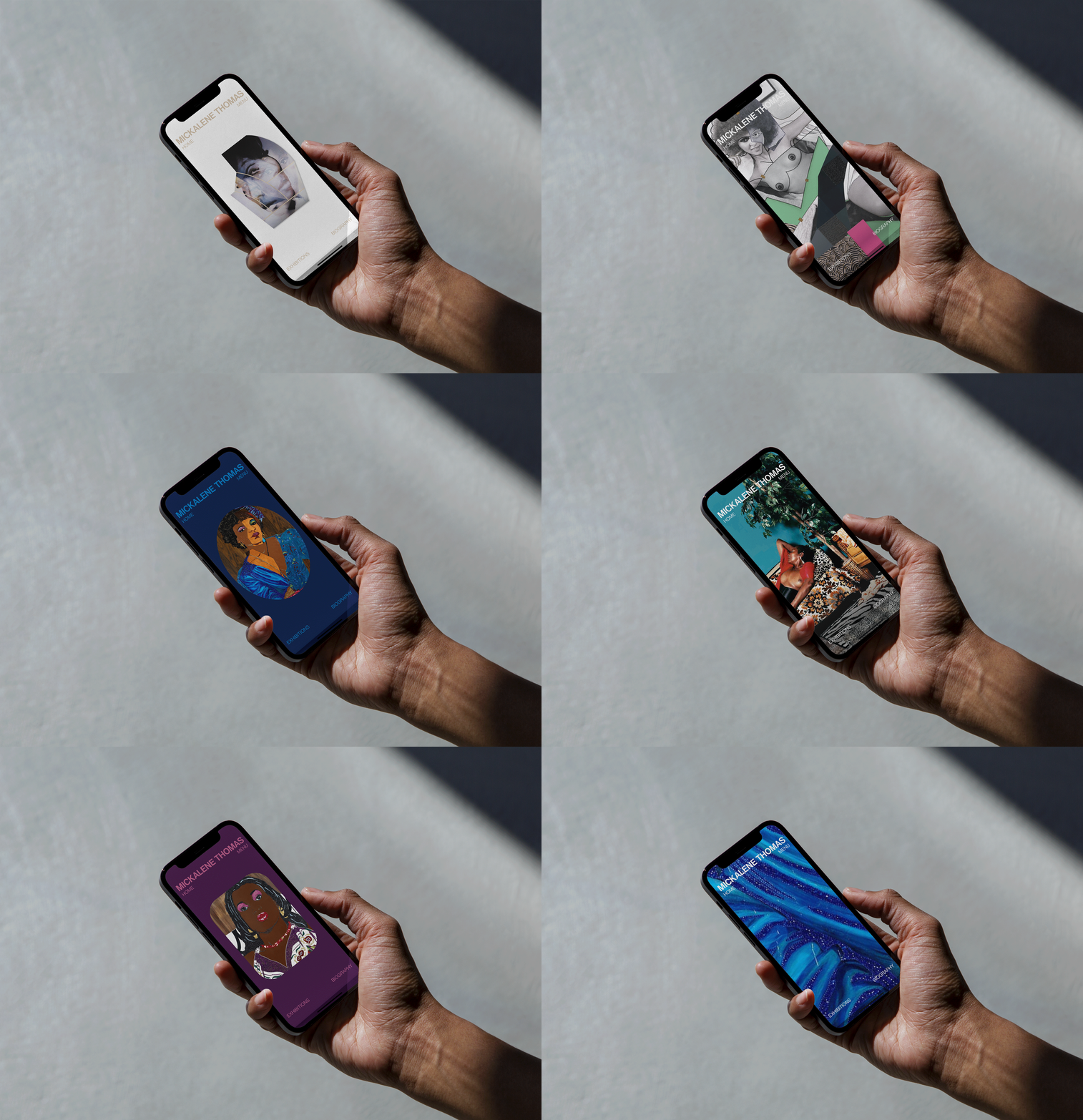
Mickalene Thomas
Against Time
Mickalene Thomas is a renowned contemporary American artist celebrated for her vibrant, complex works that explore themes of femininity, beauty, and identity. After designing a brand identity for her and her studio, Studio Mickalene, we were tasked with creating a new website that aligned with this refreshed brand vision. Our primary goals were to design a responsive portfolio website that truly represents Mickalene as an artist, addresses her design grievances with the current site, and incorporates a webshop under the sister brand, Studio Mickalene.
UX & UI Design

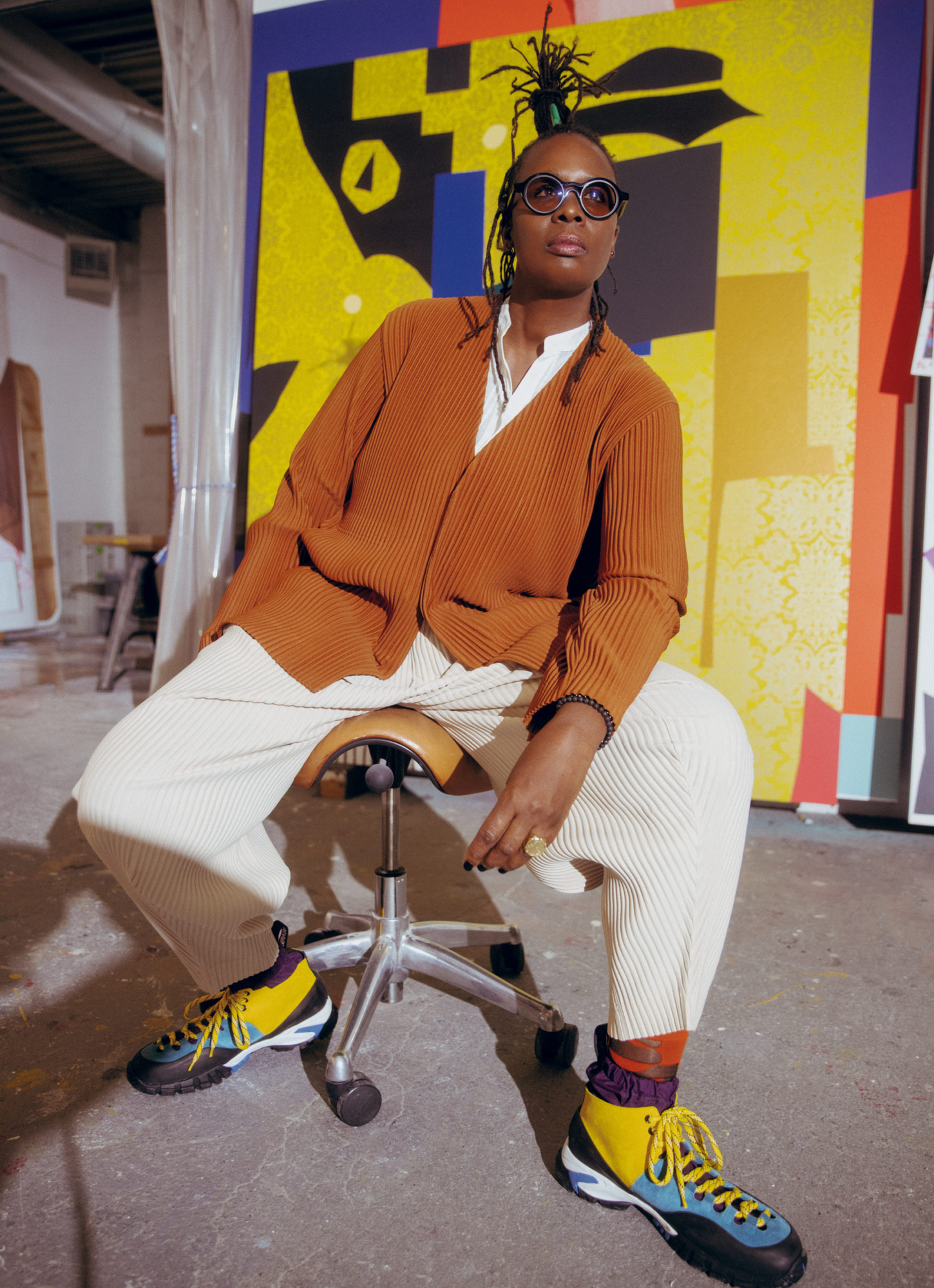
Given the project's limited time and budget, our UX process was more accelerated than usual. I began by studying similar digital products from other artists and designers, conducting an audit of the existing site, and holding stakeholder interviews with Mickalene and her team. I then defined user goals and structured the data into a customer journey map. These steps provided both design inspiration and valuable insights into areas needing improvement, enabling me to craft a more personal and effective prototype.
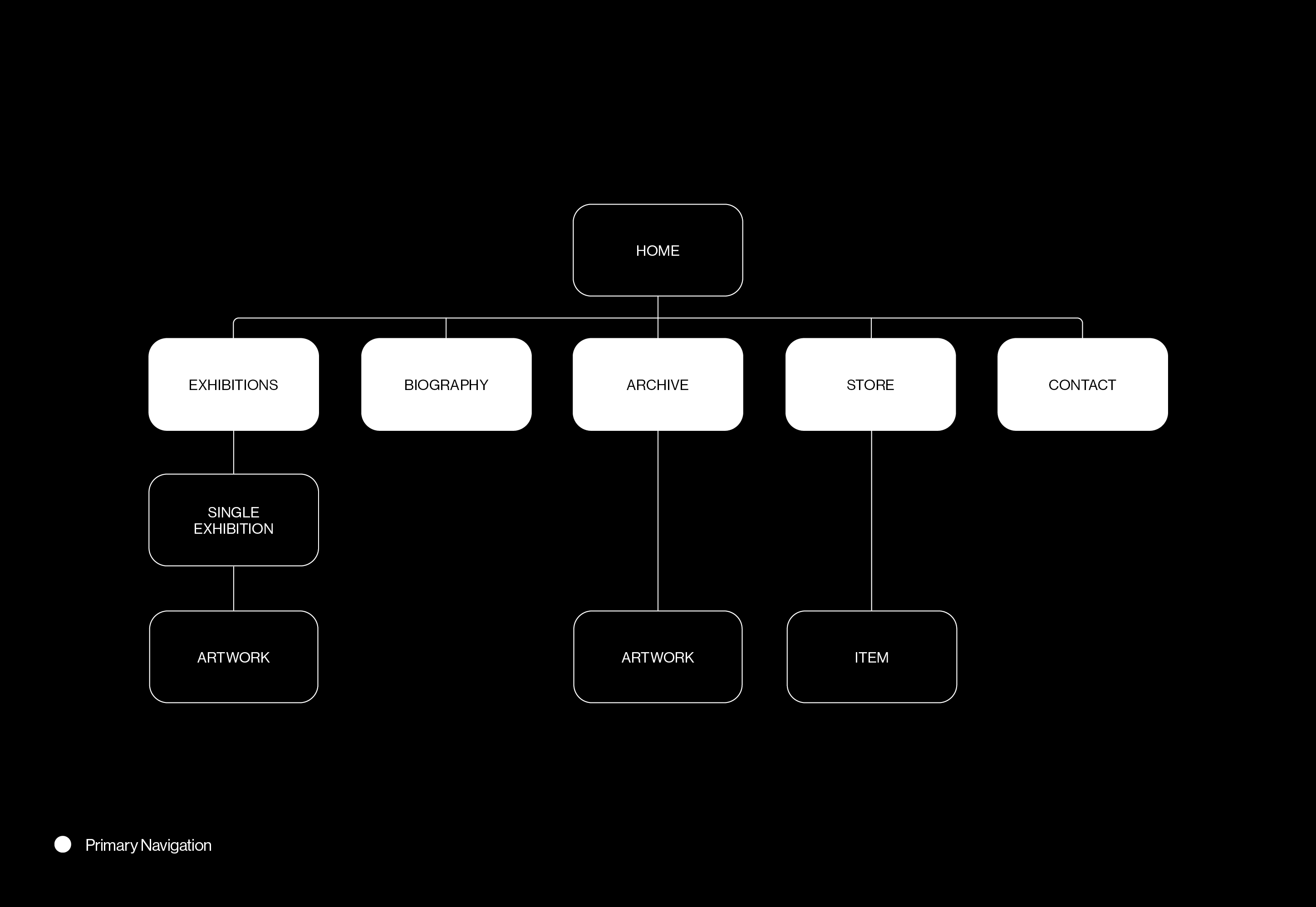
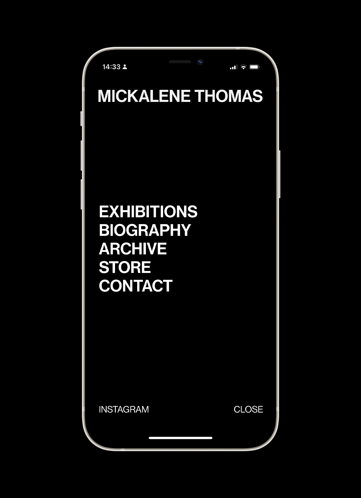
From my research, it was clear the most common use case was users seeking to learn about Mickalene and experience her art. To address this, I designed the site map to ensure minimal friction in this workflow. Her work is prominently displayed on the homepage, with full-bleed images framed by the UI, and easily accessible links to her biography and exhibitions. Additionally, other important use cases, such as contacting Mickalene for collaboration opportunities and purchasing items from the webshop, are available through the menu.
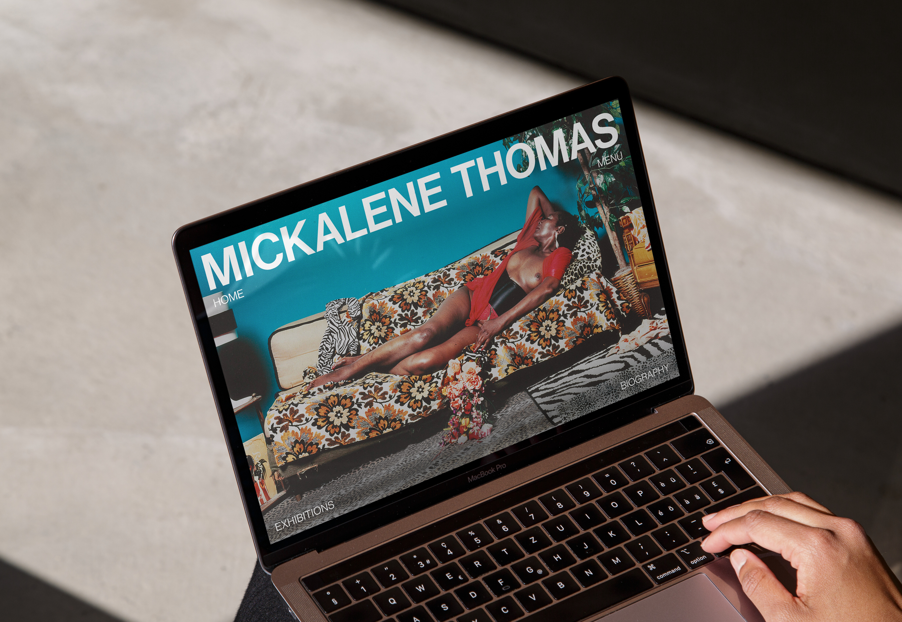
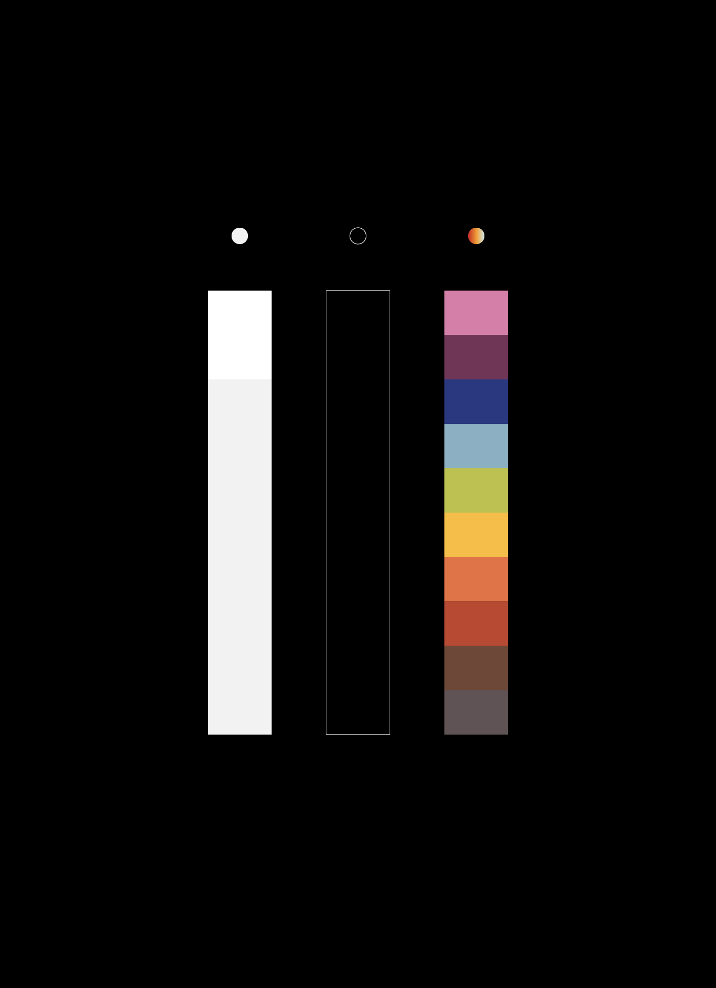
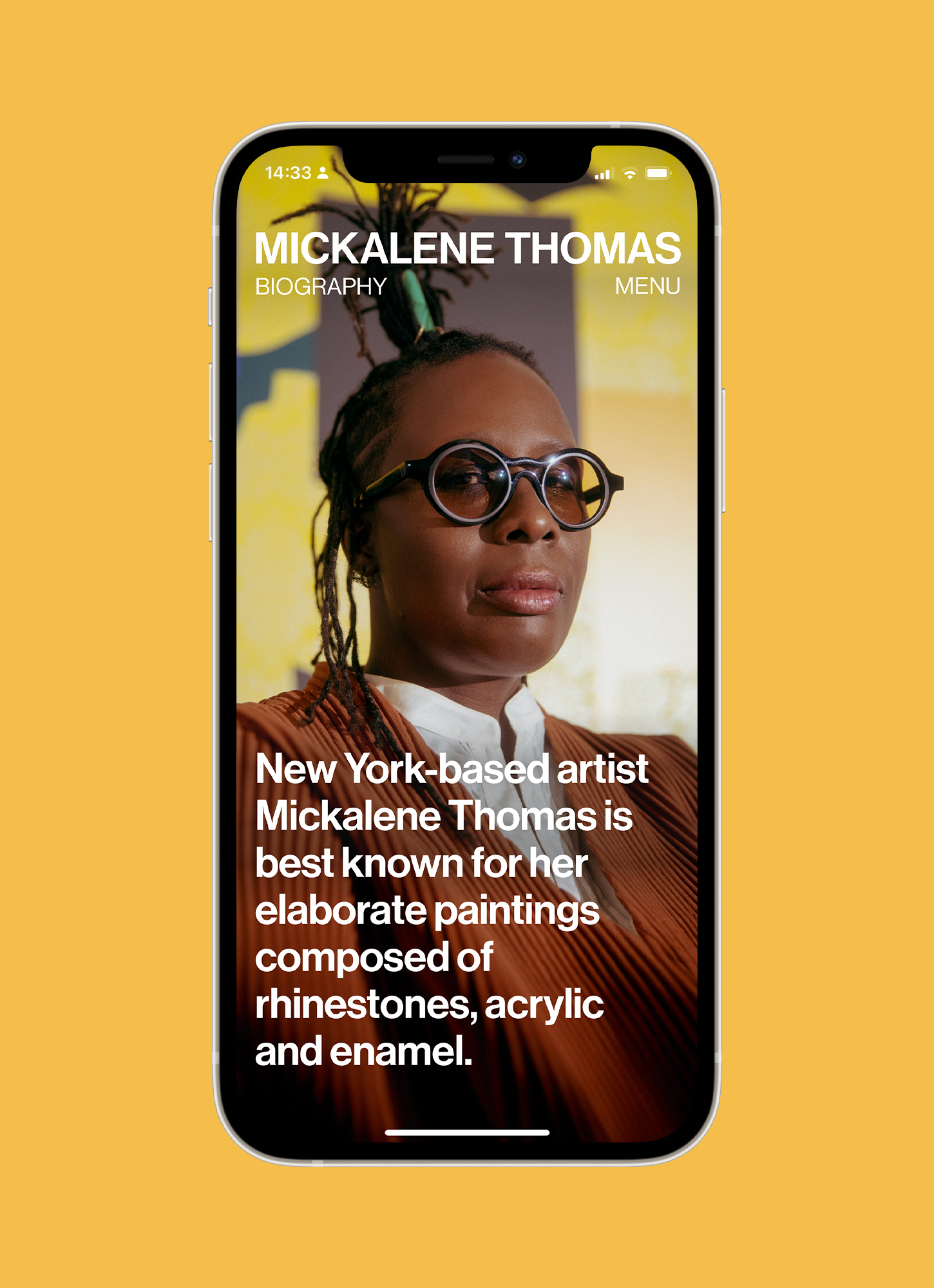
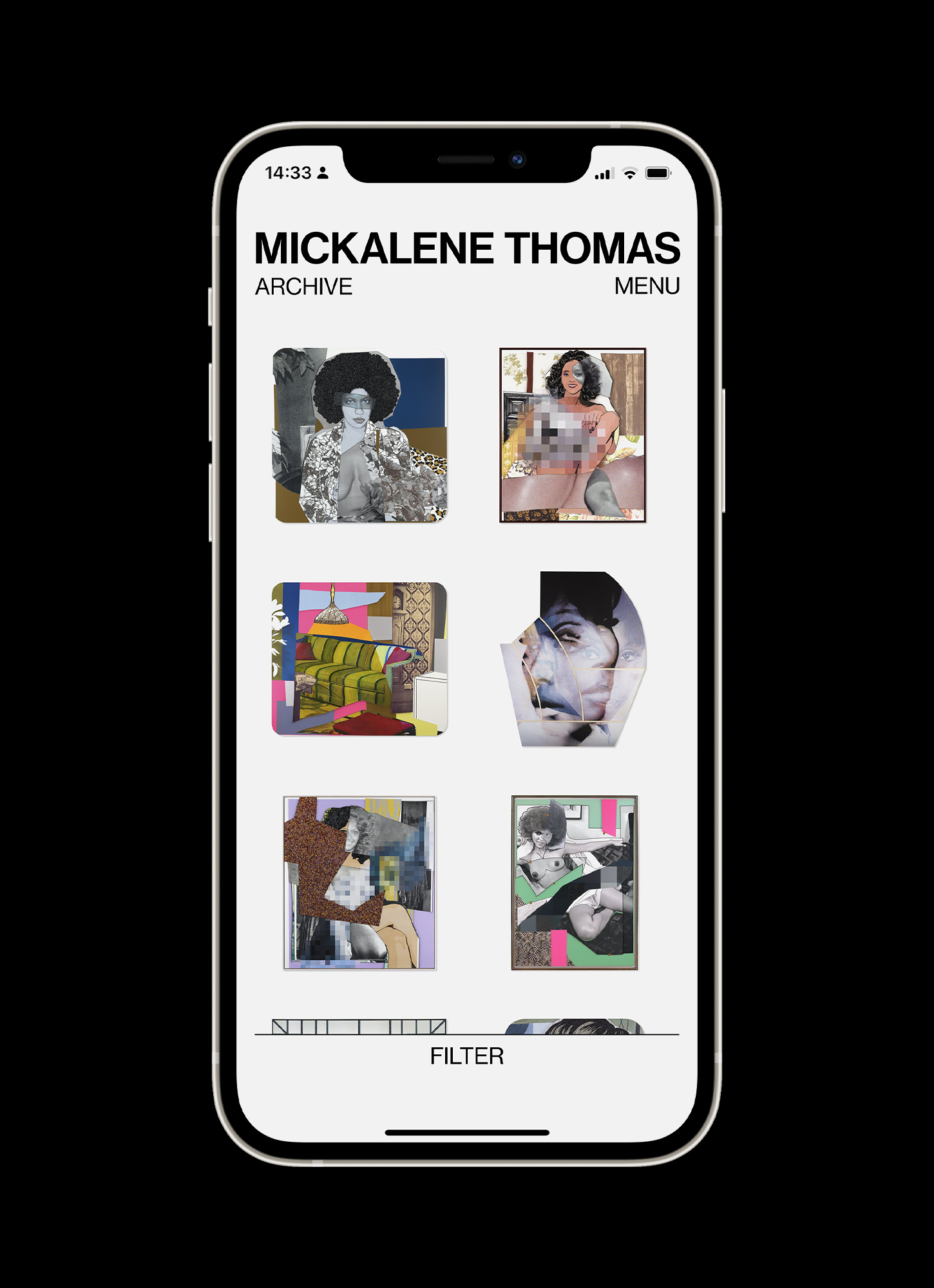
The UI design aimed to complement Mickalene's work. For example, we avoided cropping images into thumbnails to preserve the integrity of her canvas pieces. Her vivid use of color is balanced by a muted monochrome website palette, with any additional colours directly drawn from her art—all pastel shades, avoiding any overly saturated RGB hues. This approach ensures the website enhances rather than competes with her artwork.
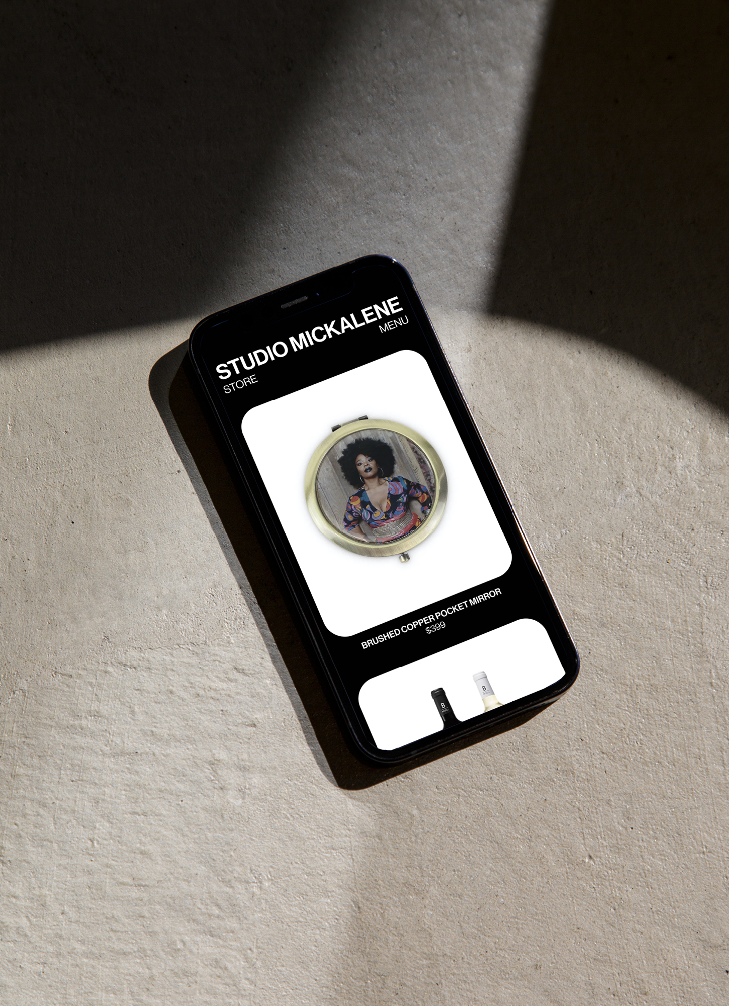
Exhibition pages were designed to mimic the experience of a real gallery, featuring a minimalist aesthetic with off-white ‘walls’ and horizontal navigation that guides the eye across the ‘space’. Users can click through to read more about each piece and see it in greater detail. The webshop section, under Studio Mickalene, uses a reversed colorway to create a visual divide between the two brand—creative and commercial. The item cards feature rounded corners, subtly nodding to the soft, curved bezels often seen in Mickalene’s paintings.
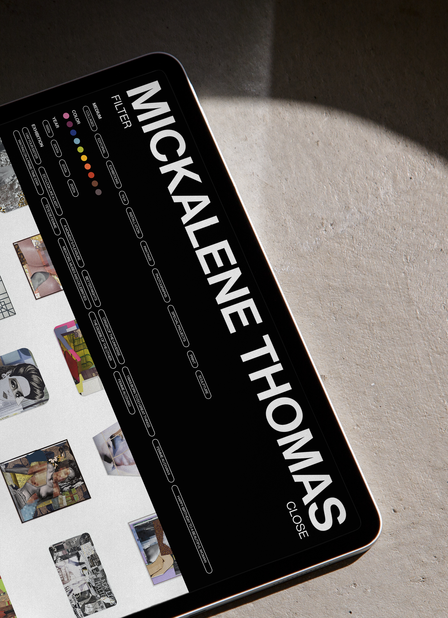
Overall, this project allowed us to create a digital space that truly reflects Mickalene Thomas's artistic vision, providing users with an intuitive and immersive experience while showcasing her remarkable body of work.