Vali Air
Vali Air, a start-up airline, was looking to design its inaugural website. Acknowledging the prevalent design issues in the industry, they wanted to enhance the flight booking experience, specifically focusing on user-friendly search and selection on mobile.
Throughout this project, I applied UX design principles to create a more efficient and intuitive online booking system, driven by a profound understanding of their target users.
Project Goals:
Design a clickable flight-booking mobile site prototype that;
Is fast, easy, and intuitive
Address competitors’ design flaws and pain points
Can be tested and validated by users
My Role:
Research and analysis
User experience design
Prototype build
The Strategy
Initially, I gained insights by studying similar digital products from other airlines and flight aggregators, as well as observing real users in action. These observations revealed various pain points and areas where I could improve. I then defined and framed the problem, and gave structure to a large volume of raw data. This foundation enabled me to craft a more efficient user flow and ultimately guided the prototype design and testing of the final solution.
Here is a concise overview of my comprehensive UX design process:
01 / Research
Identify the problem
Competitive Benchmarking
Online Survey
Usability Testing
02 / Analysis
Articulate the problem
Affinity Diagram
Customer Journey Map
03 / Design
Create the solution
Flow Diagram
Interaction Design
Prototyping
04 / Validate
Test the solution
Usability Testing the Prototype
01 / Research
What solutions have other airlines found to address the problem?
My process began with a close look at similar digital products, helping me grasp how others in the industry have dealt with the same issue. This exploration not only revealed their strategies but also gave me valuable insights into the problem itself.
I focused on the industry's conventions and practices
What's the industry standard? What do people typically expect and recognise? What’s hitting the mark, and what doesn’t?
Competitive Benchmarking
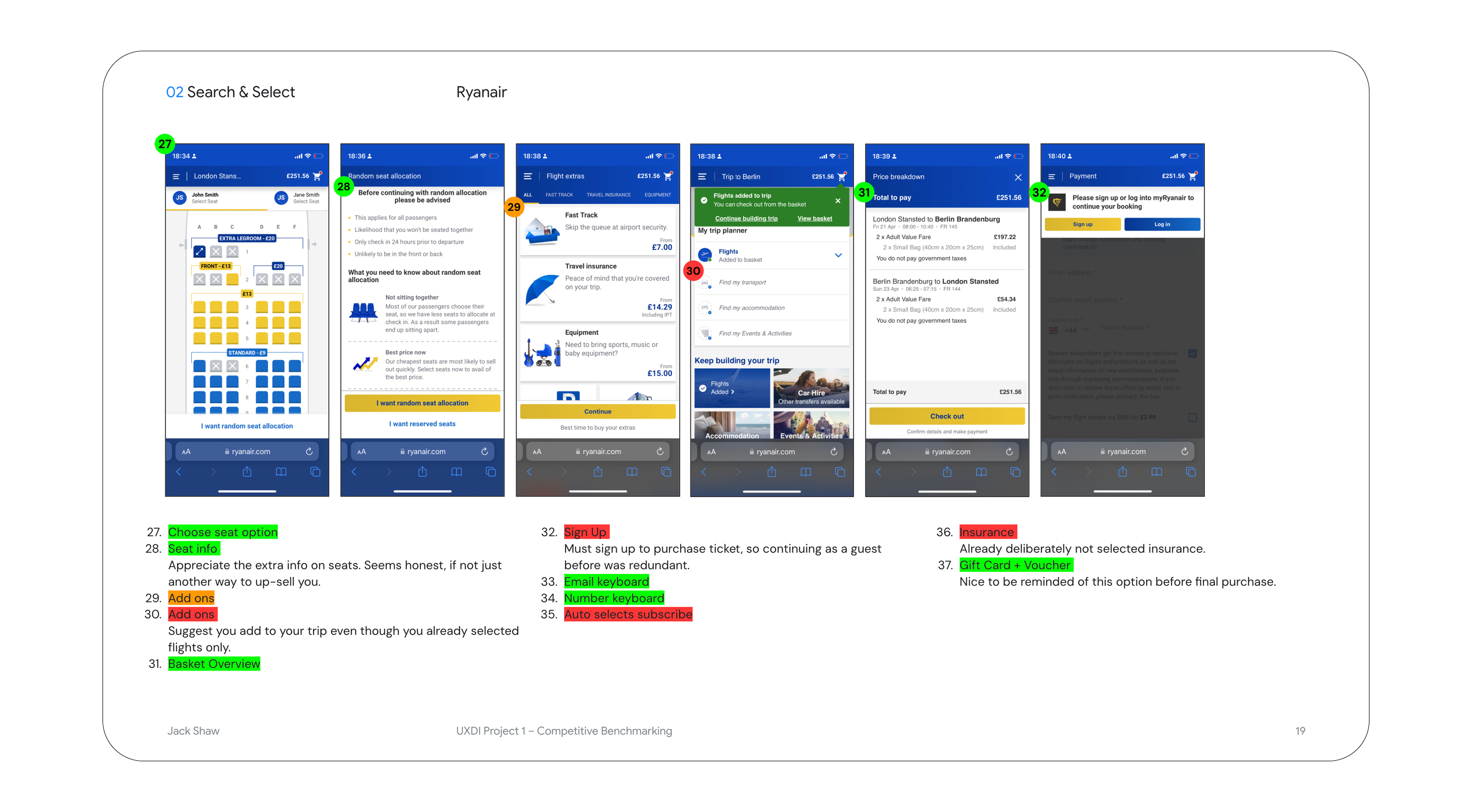
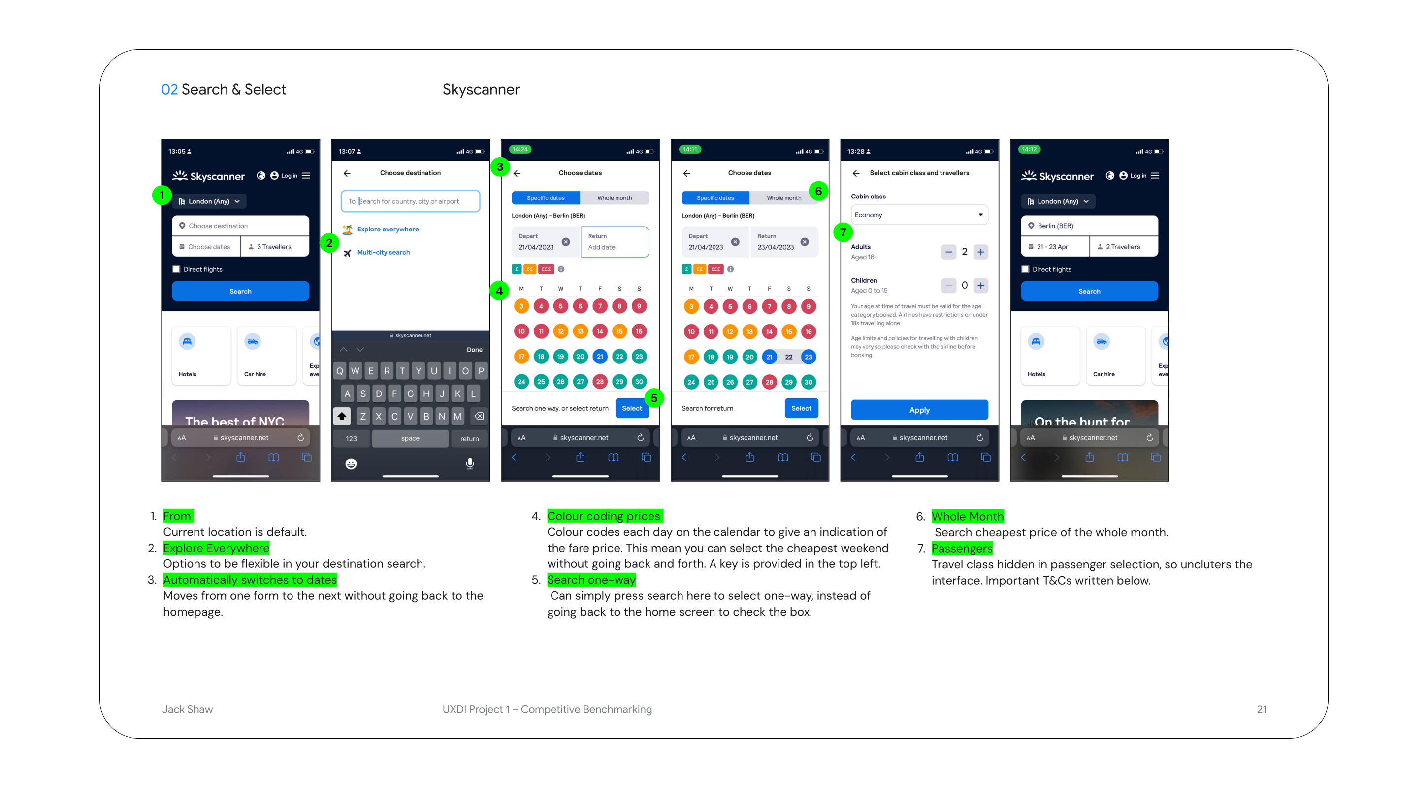
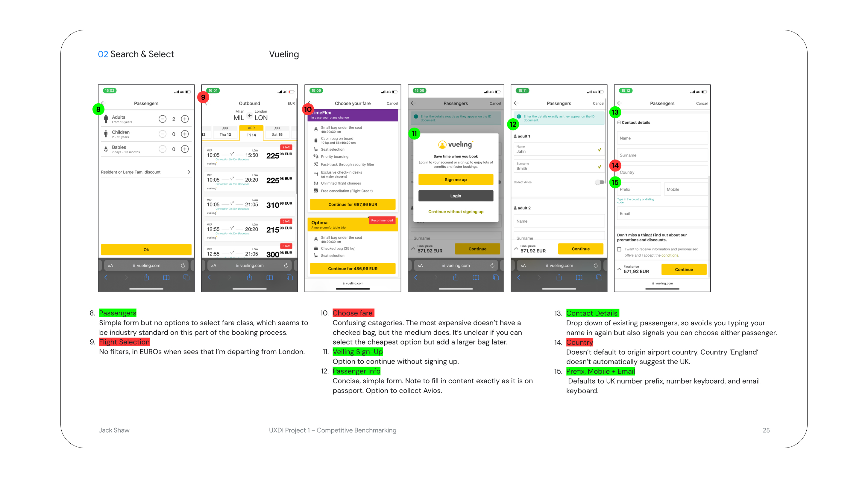
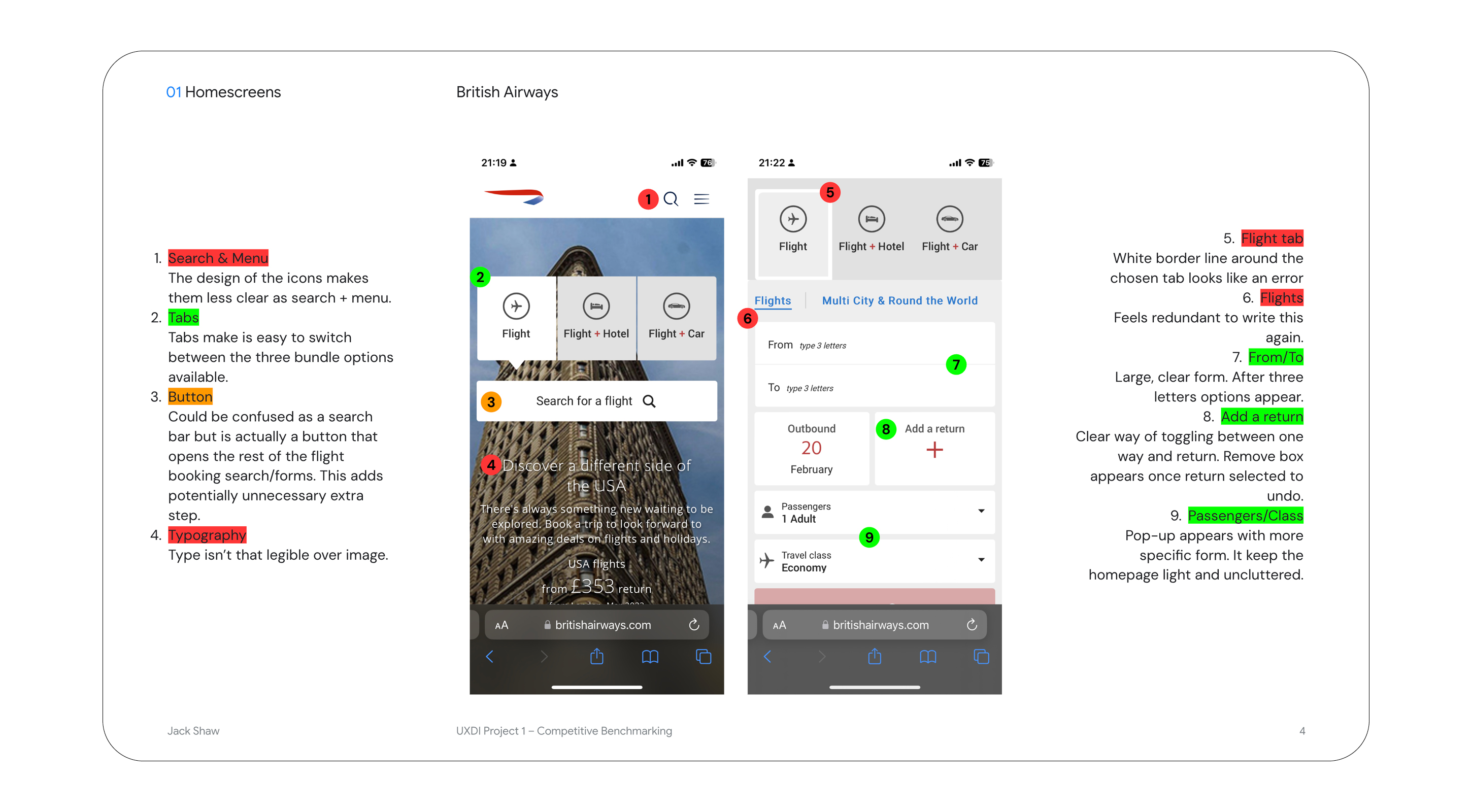
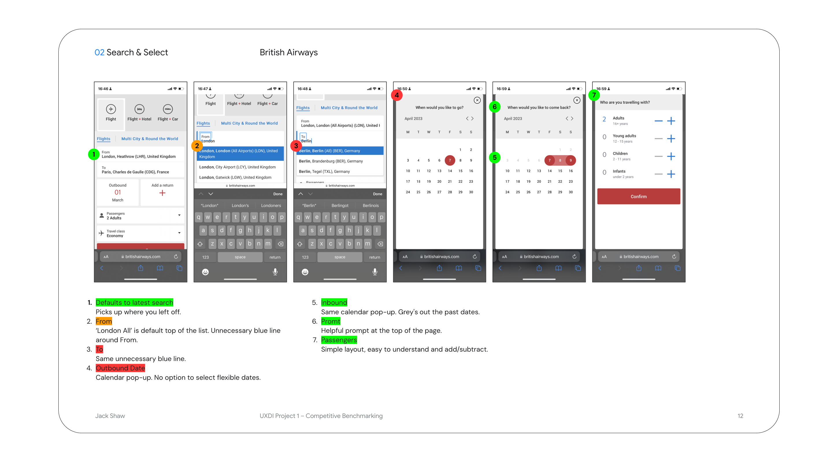
I conducted an in-depth analysis of five mobile sites, benchmarking them to uncover pain points I should avoid and opportunities worth adopting.
I captured the details of the flight reservation process from: Ryan Air, Vueling, British Airways, AirAsia and SkyScanner.
Key findings:
- Plenty of industry-standard conventions to adhere to, such as the typical booking flow.
- Lots of quick wins, those minor annoyances that can be sorted out with ease.
- Some widespread industry issues, notably excessive advertising and feature overload.
Online Survey
I designed an online survey to learn about users’ goals, obstacles, and feature preferences. After defining my research objectives, I composed the questions, distributed the survey to recent flight bookers, and then sorted the collected data.
Key findings:
- The most common user goal was checking flight prices and booking flights.
- Users wanted to make the flight price comparison easier.
- Users wanted to reduce the number of add-ons, to shorten the booking process.
- The majority of users first explored flight aggregators before visiting airline websites.
- Some users switched from mobile to desktop for perceived safety and improved user-friendliness.
I was looking for both quantitative and qualitative data
Structured data was transformed into charts and graphs, while unstructured data was organised into spreadsheets so the answers could be categorised to create structured data.
Can we avoid the switch?
The last point highlighted an opportunity to design an application that streamlines flight price comparison and booking, eliminating the need for users to switch between mobile and desktop.
Usability Testing
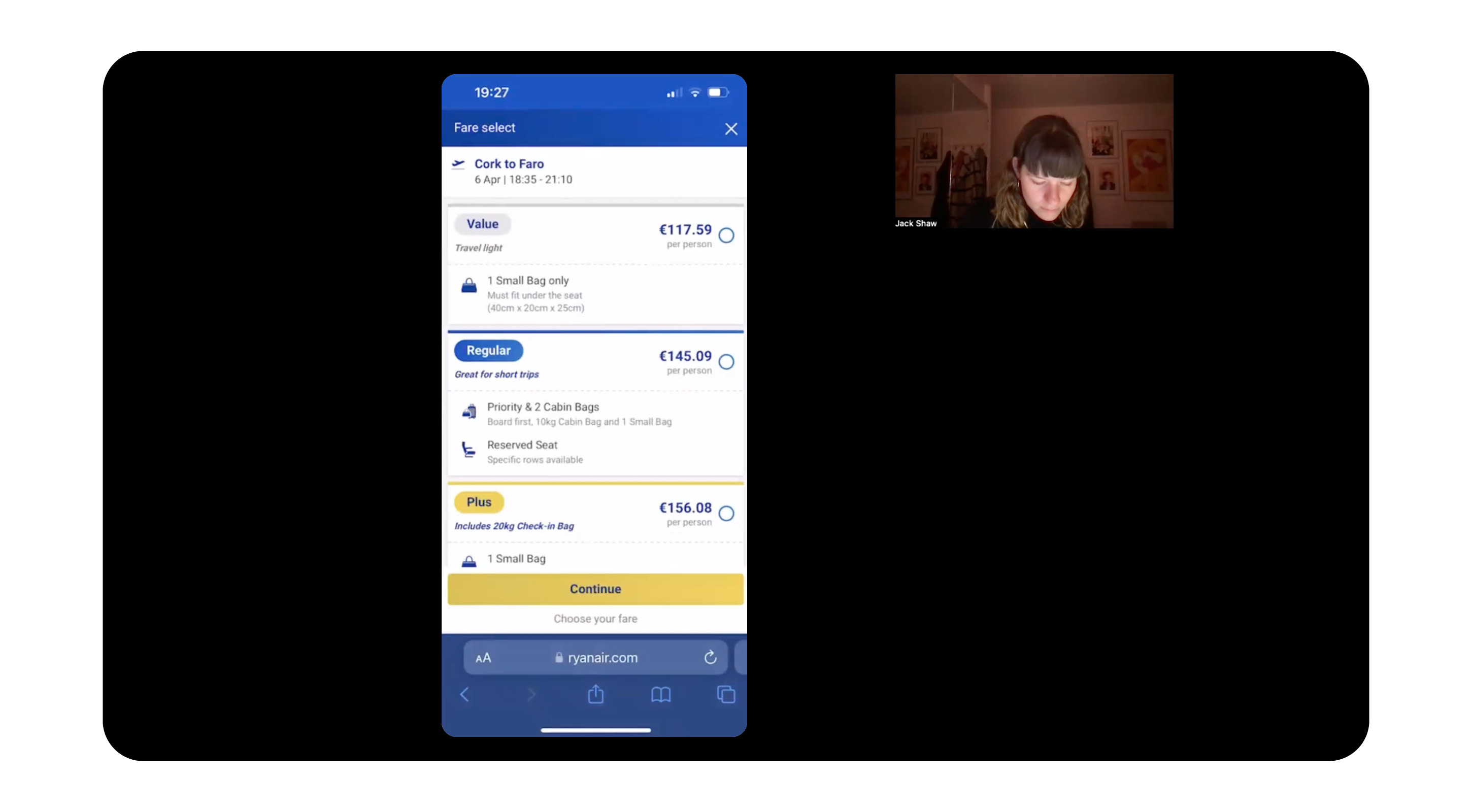
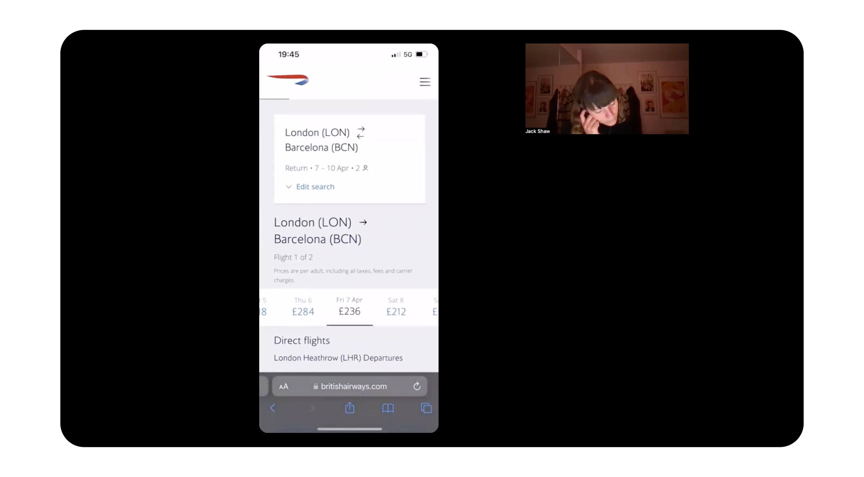
I conducted a series of usability tests because I wanted to understand the context, goals, and behaviours of airline website users; what are they trying to do, who are they with, and their device preferences?
After defining my research objectives I wrote a screener to find participants, and then the test script, before conducting the tests. I summarised my findings in a series of notes to be analysed later.
Some key findings:
Positive
- Users loved clean, simple-looking design interfaces.
- Appreciated sites with easy navigation.
- When fare options, and their content, were clearly communicated.
Pain Points
Flights connections are not being clearly highlighted.
Not having a sort feature to order flights by price.
Being advertised features more than once.
When only one flight was available, users didn’t register they had to select the flight card to continue.
When calendars did not clearly indicate which flight date you were selecting.
Note Worthy
- Generally would visit an aggregator before visiting an airline site.
- Wanted a traffic light system to compare prices on the calendar
- Both scrolled and typed in locations.
- Shared flight information with a screenshot and sent this via WhatsApp.
- They weren’t interested in any ‘flex’ option.
02 / Analysis
What insights shaped my understanding of the problem?
I started analysing my research data with the aim of defining the user problems I needed to address and gaining valuable insights for my design approach.
To make sense of the raw data and truly comprehend the challenges, I created an infinity diagram and customer journey map.
Infinity Diagram
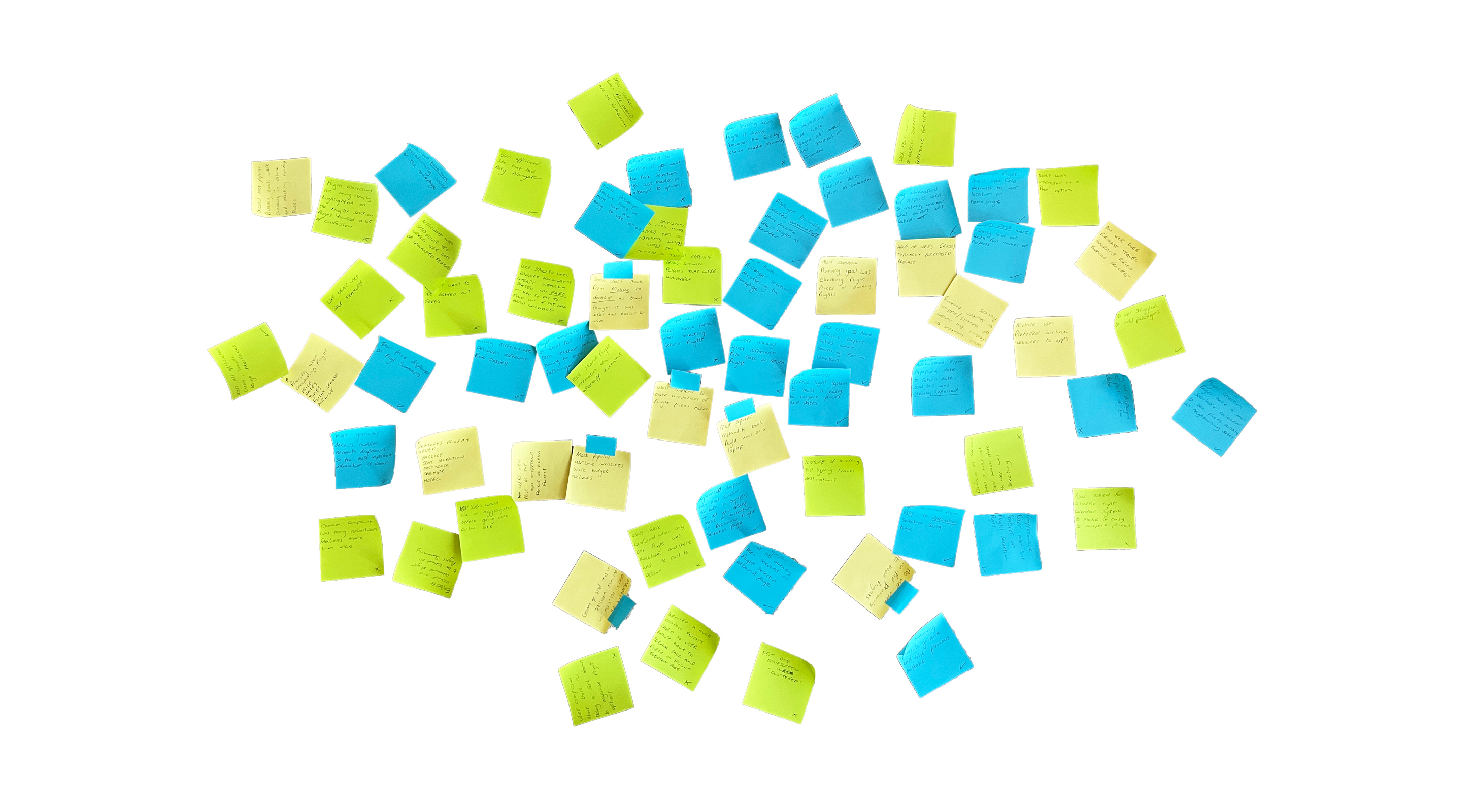
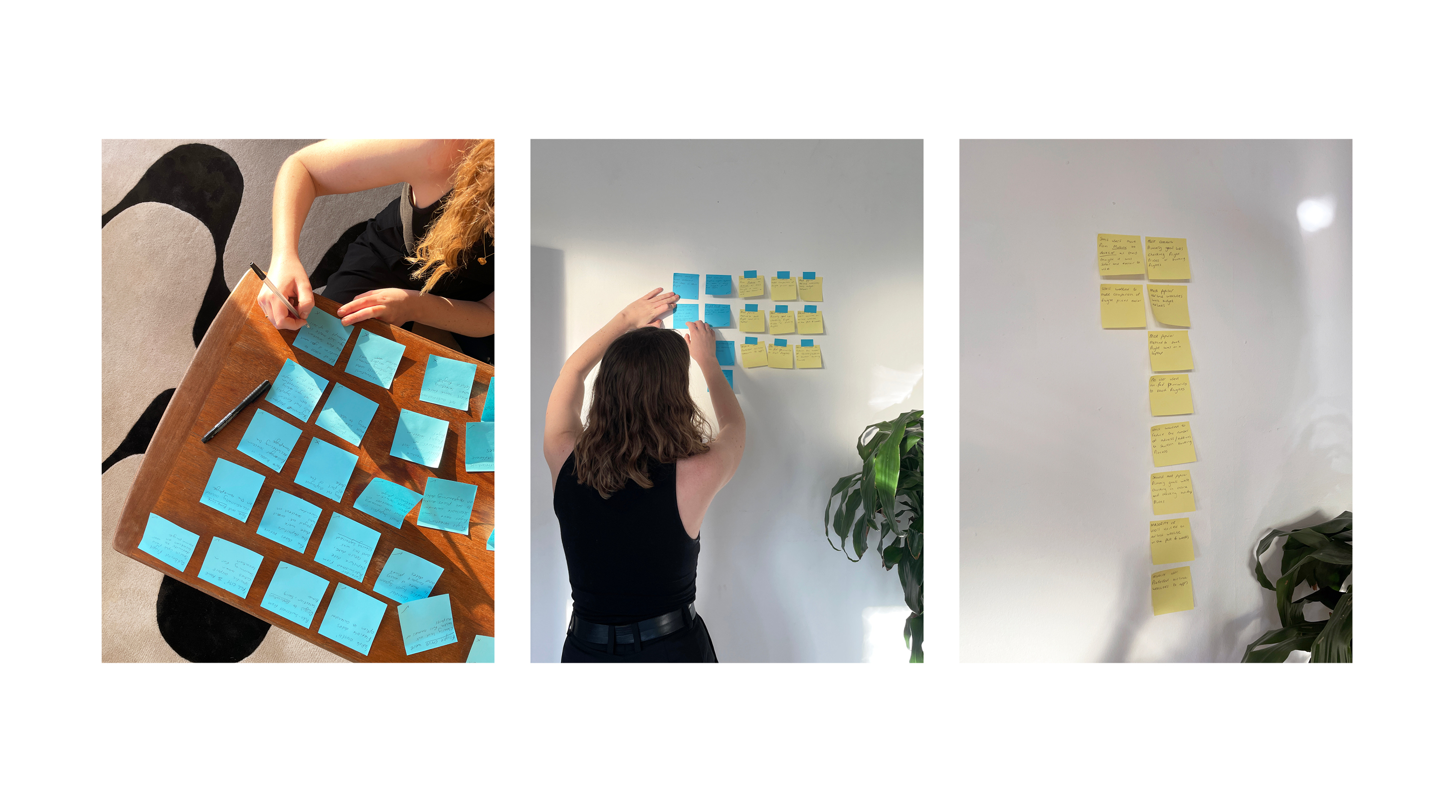
During an affinity diagram session, we gave my qualitative research data some structure, aiding analysis which would ultimately guide my design decisions.
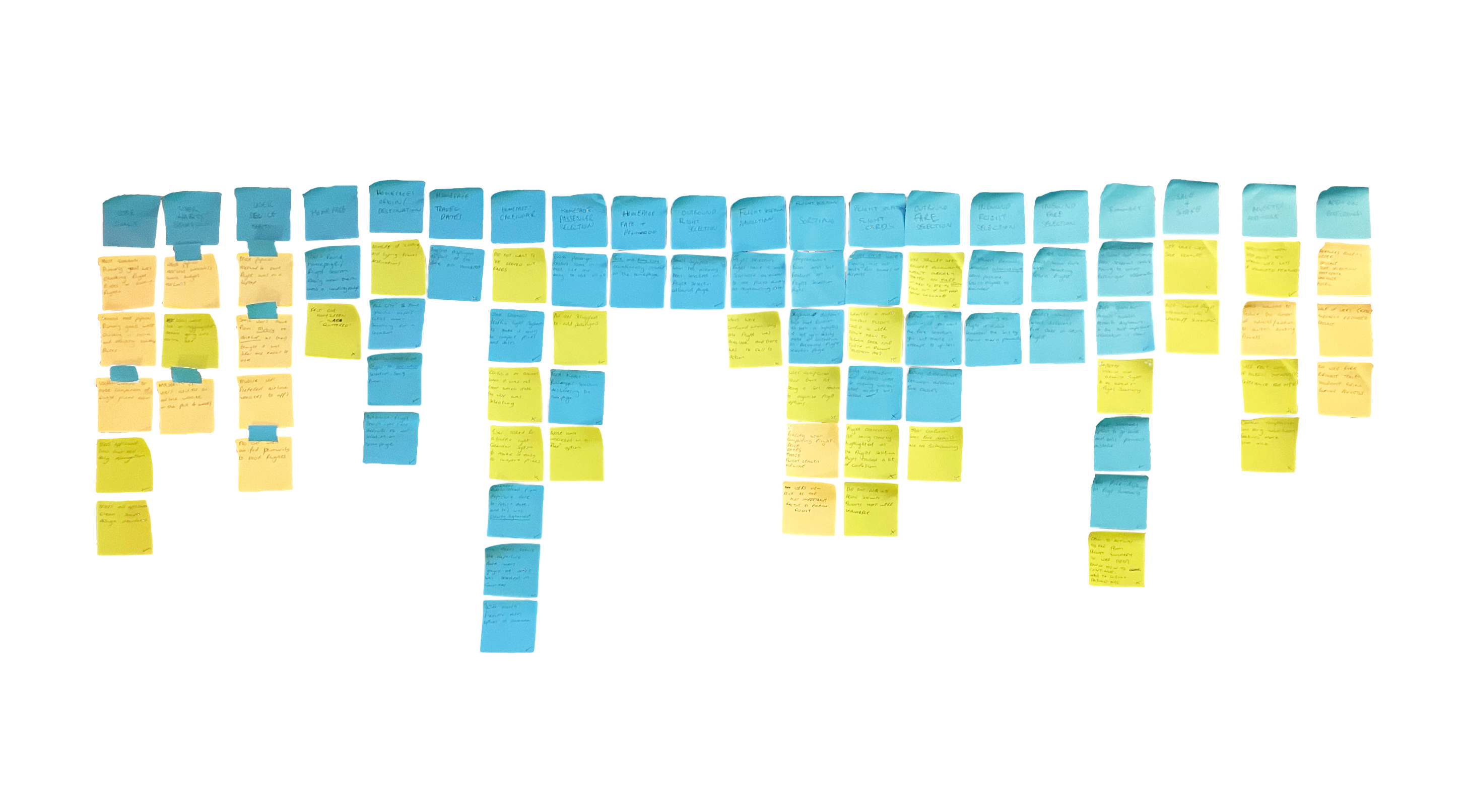
In collaboration with my team, we collectively reviewed the data, jotted down crucial points on post-its, categorised them, and then arranged them roughly in chronological order – giving us an initial insight into the user's journey.
The final result was 65 key insights and 20 categories which I could use to build my customer journey map.
Customer Journey Map
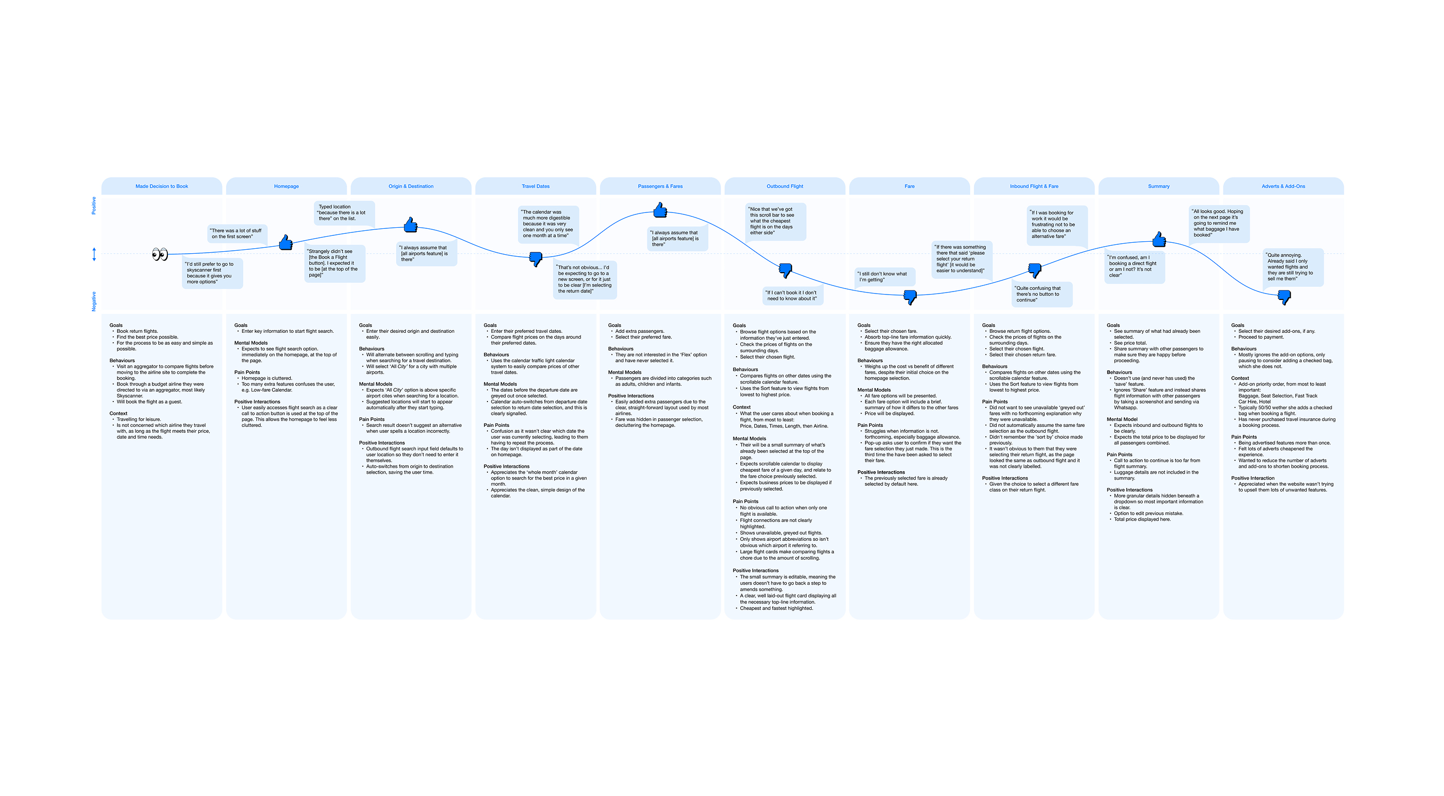
Building on my affinity diagram, I decided to create a customer journey map to add more structure to the analysis of my research data. My goal was to outline the key stages in the customer journey.
For each stage, I documented user goals, positive interactions, pain points, and any behaviours that the website or app didn't adequately support.
→ Customer Journey Map
Evaluating the user's experience and adding their voice
I then assessed whether each stage was positive or negative and, when relevant, included user quotes to bring the map to life.
Key findings:
- The user experience in selecting their origin, destination, and passenger details is pretty positive, with well-established conventions set by competitors in the industry.
- The stages in need of the most improvement are the flight and fare screens.
- Adverts and unwanted add-ons that create friction between flight search and checkout were the most negative part of the user's experience.
An annoying necessity?
I aimed to balance providing a great user experience while also creating opportunities for advertising, crucial for revenue generation despite being disliked by customers.
03 / Design
How did I come to the solution to the problem?
Satisfied I could now articulate the problem, I was ready to start solving it. My overarching goal was to address all the issues uncovered during my research – everything highlighted in my affinity diagram and customer journey map. I wanted to incorporate trusted design patterns and principles, particularly those specific to creating an effective application on mobile.
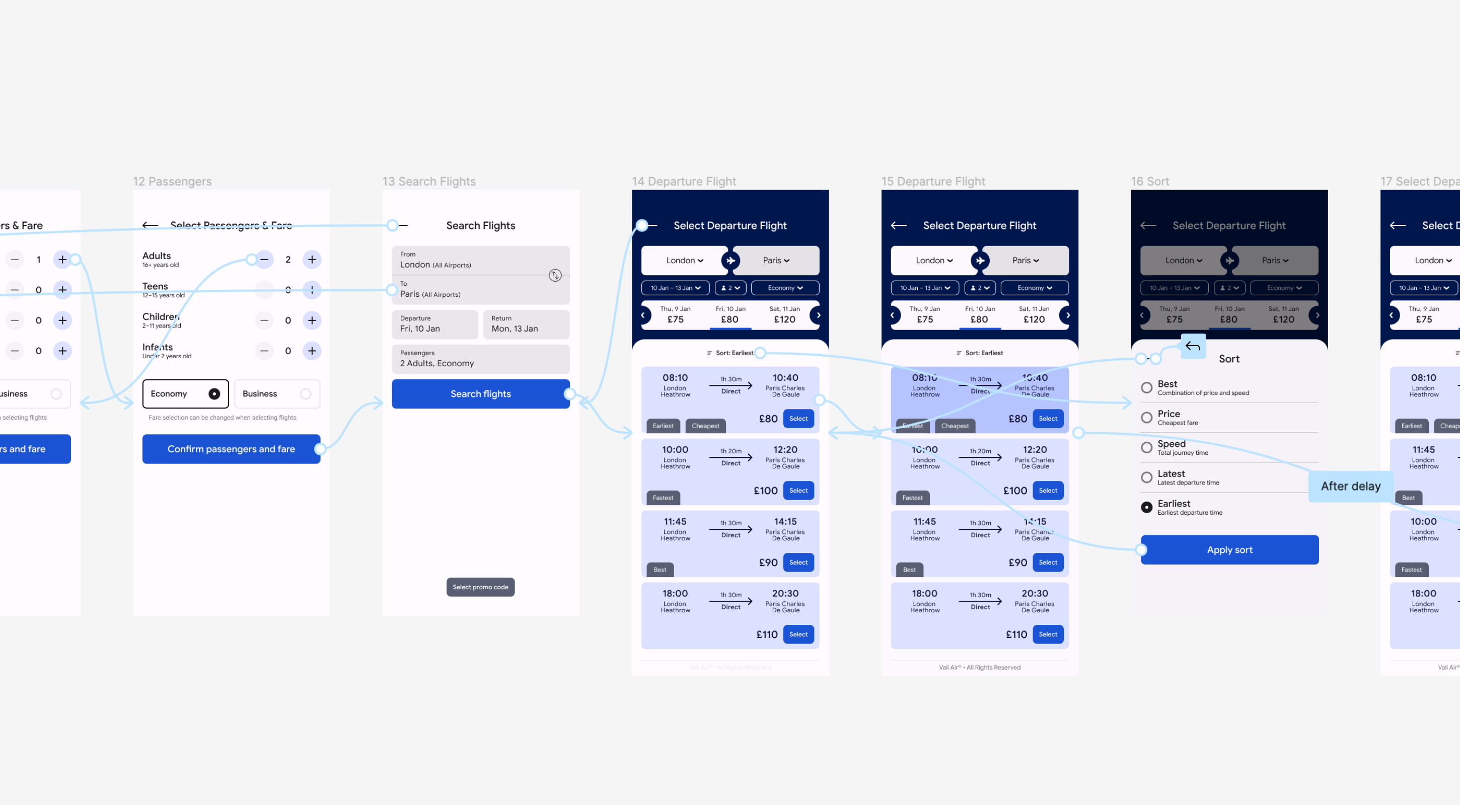
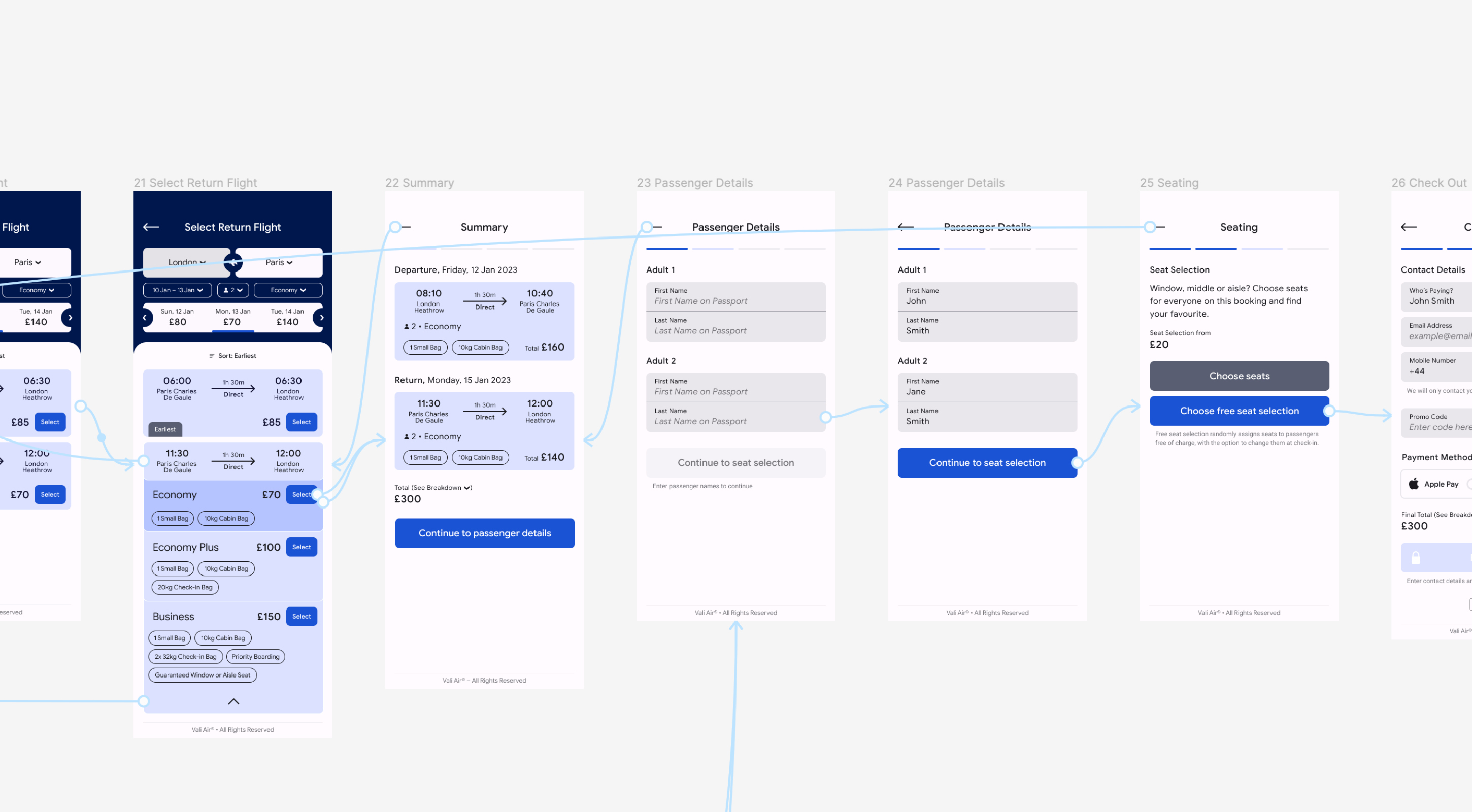
After creating my flow diagram, I started to sketch out my final design which would lead to me building the final prototype.
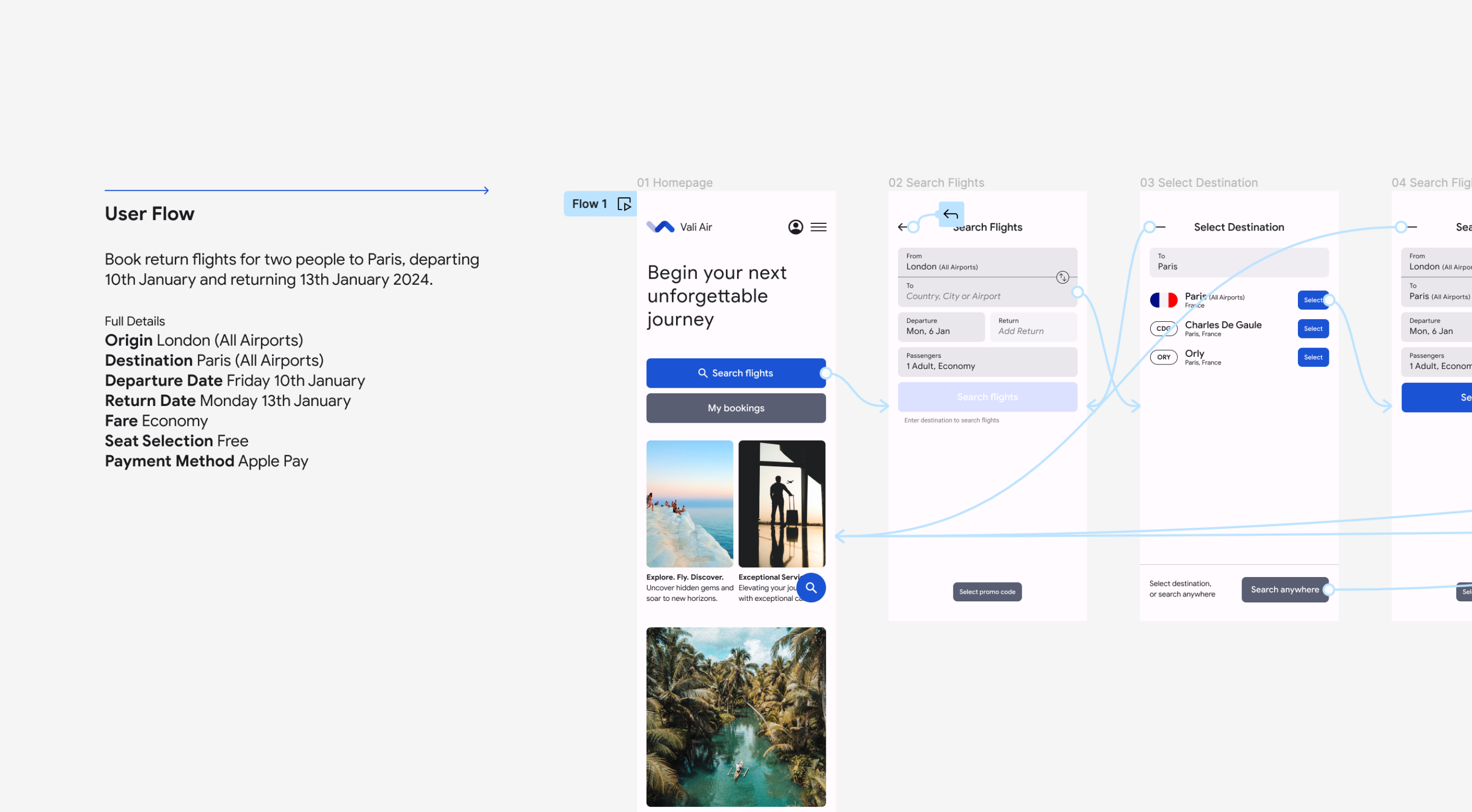
Flow Diagram
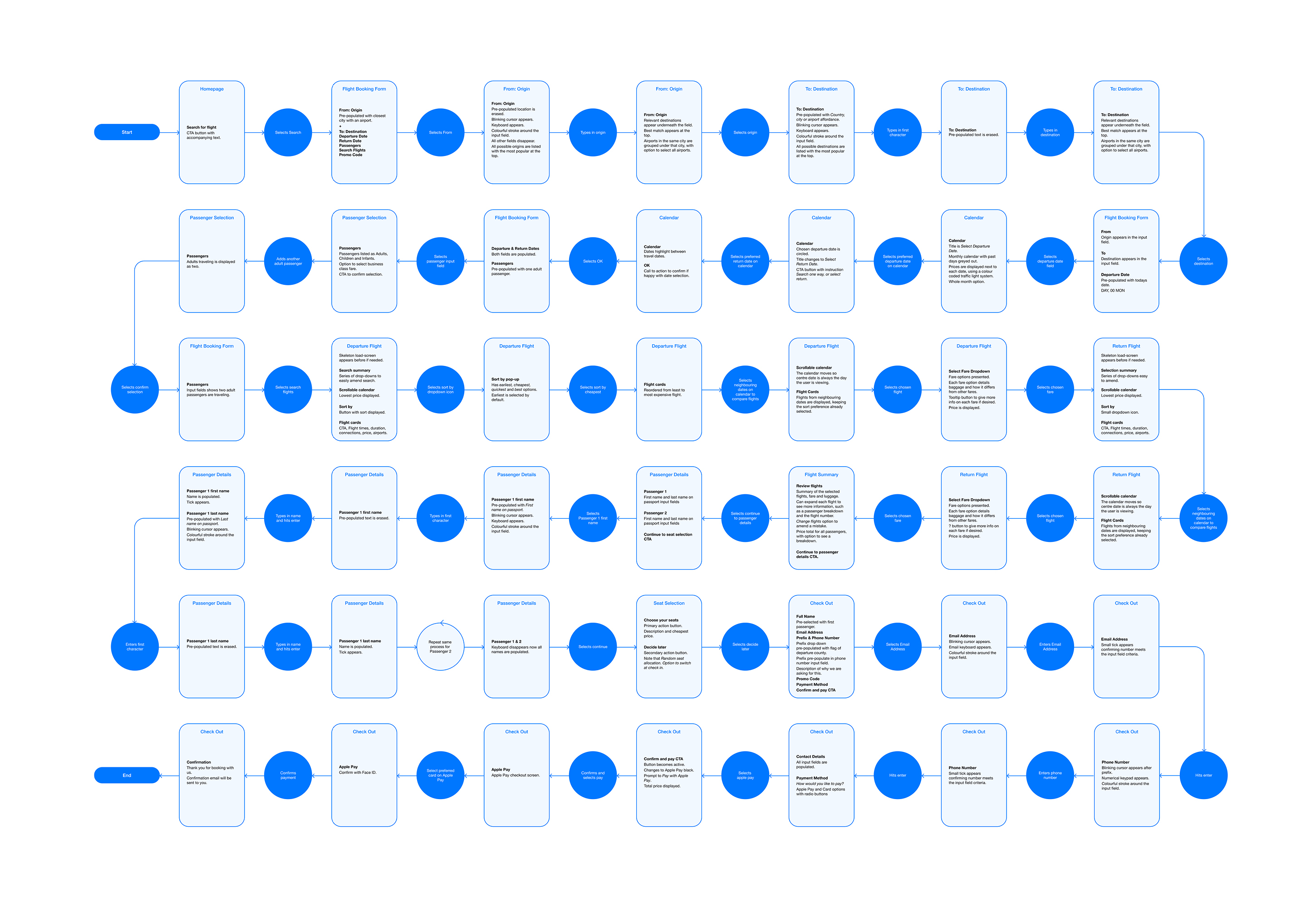
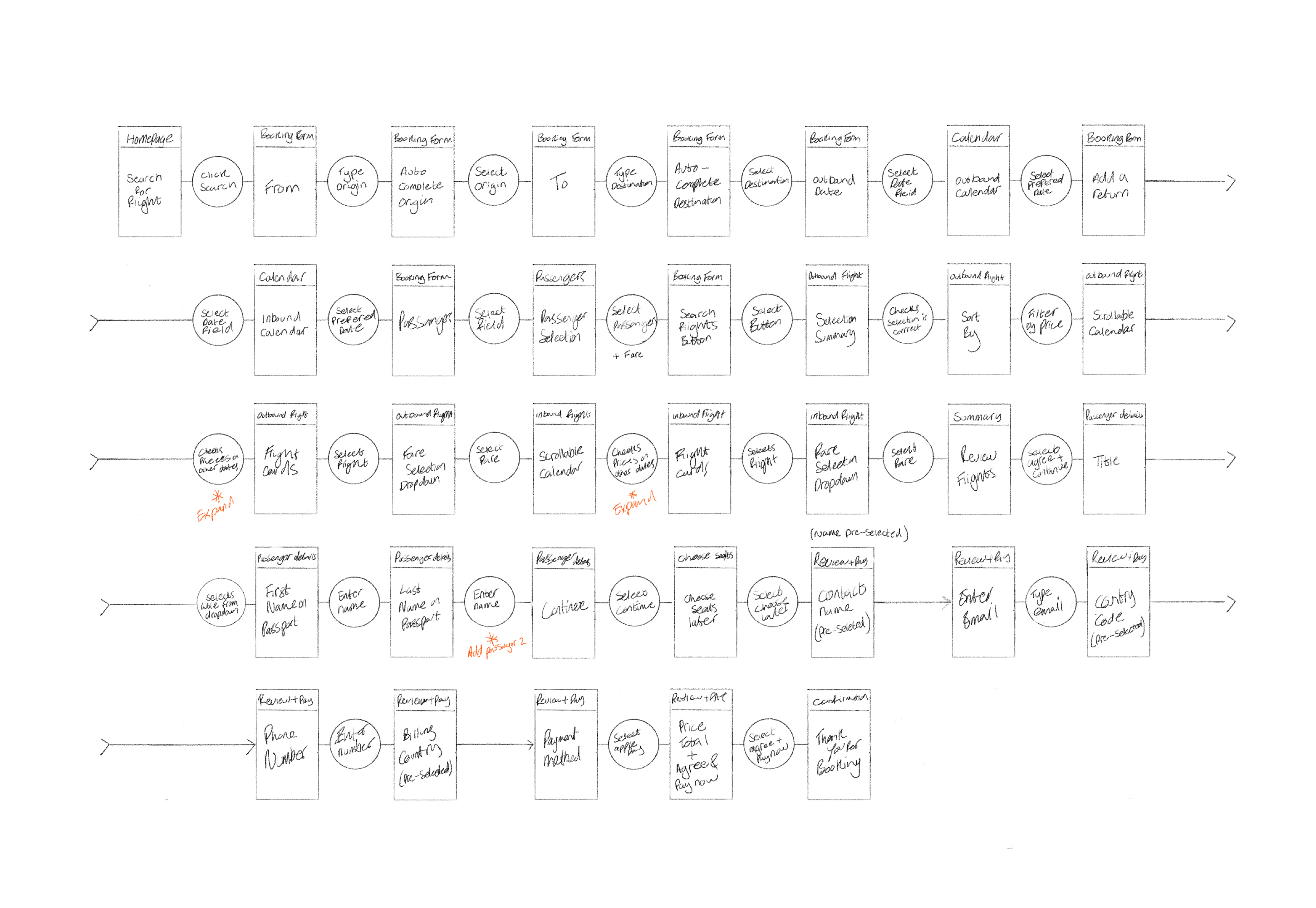
My goal was to design the high-level booking process for the website, saving the user steps wherever possible and smoothing the whole process.
I began with sketches, detailing everything from the user's arrival on the website to receiving the flight booking confirmation, using boxes for screens or states and circles for interactions. After a few rounds of tweaking, I arrived at a solution I was happy with and then transferred the final flow to Figma.
→ Flow Diagram
Narrowing the focus
By focusing solely on the primary use case, I could address the core problem without distractions from issues found in other use and edge cases that may have come up in my research.
Notable areas of improvement:
- Concise flow: Removed unnecessary optional add-ons to shorten the flow.
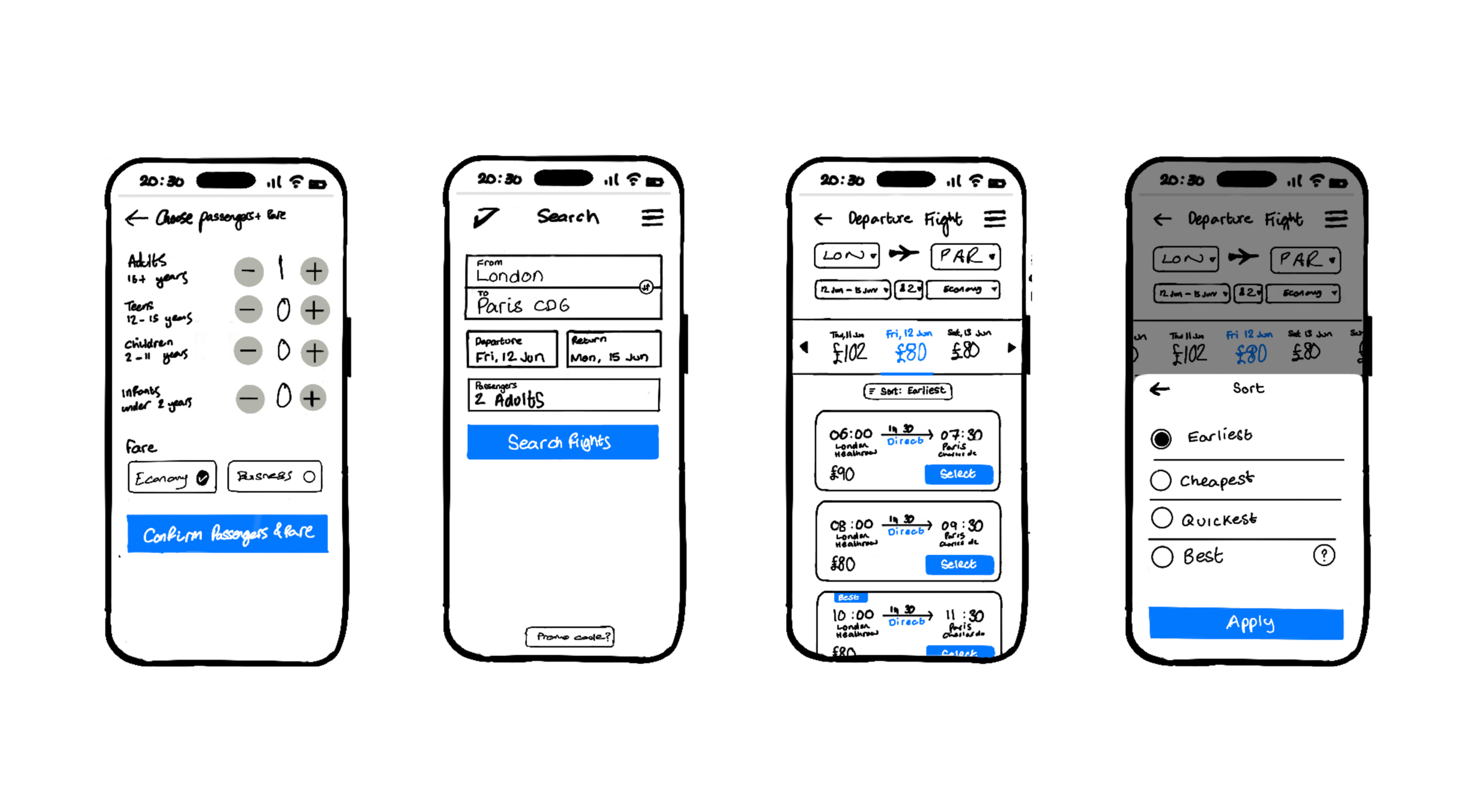
- Easier to find the cheapest flight: Introduced user-friendly features such as flight sorting and searching by entire months.
- Use of smart defaults: Automatically suggested the nearest departure airport and pre-selected return fares for a smoother experience.
- More forthcoming: Presented all fare information when the user selected their preferred option to avoid later confirmations.
- More forgiving: Allowed users to easily amend their search in case of mistakes.
- Increased perceivability: Added clear call-to-action buttons on each flight card.
- Progressive disclosure: I slowly ask the user for more information throughout the booking process, to reduce complexity by only showing what is necessary on a given screen.
Interaction Design
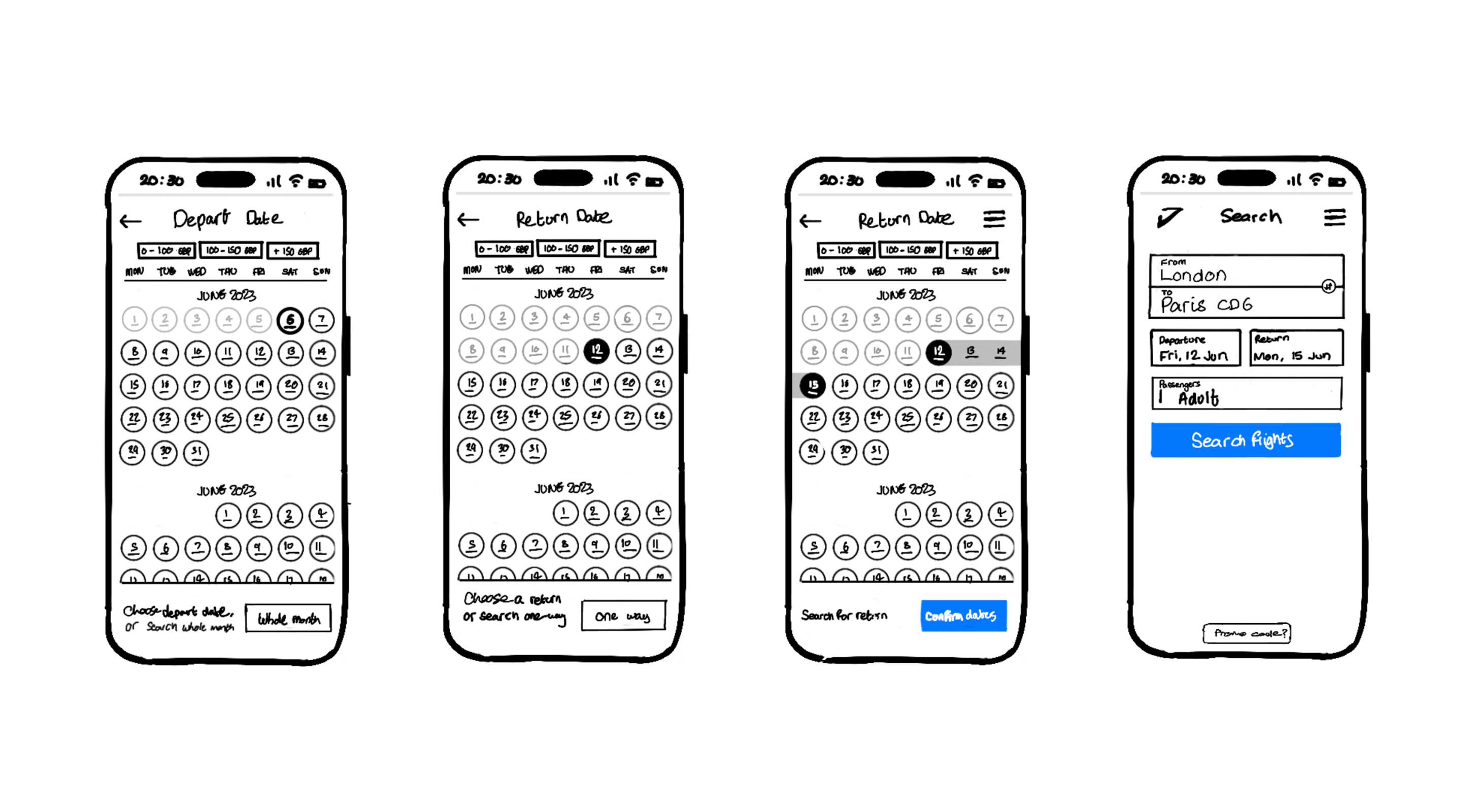
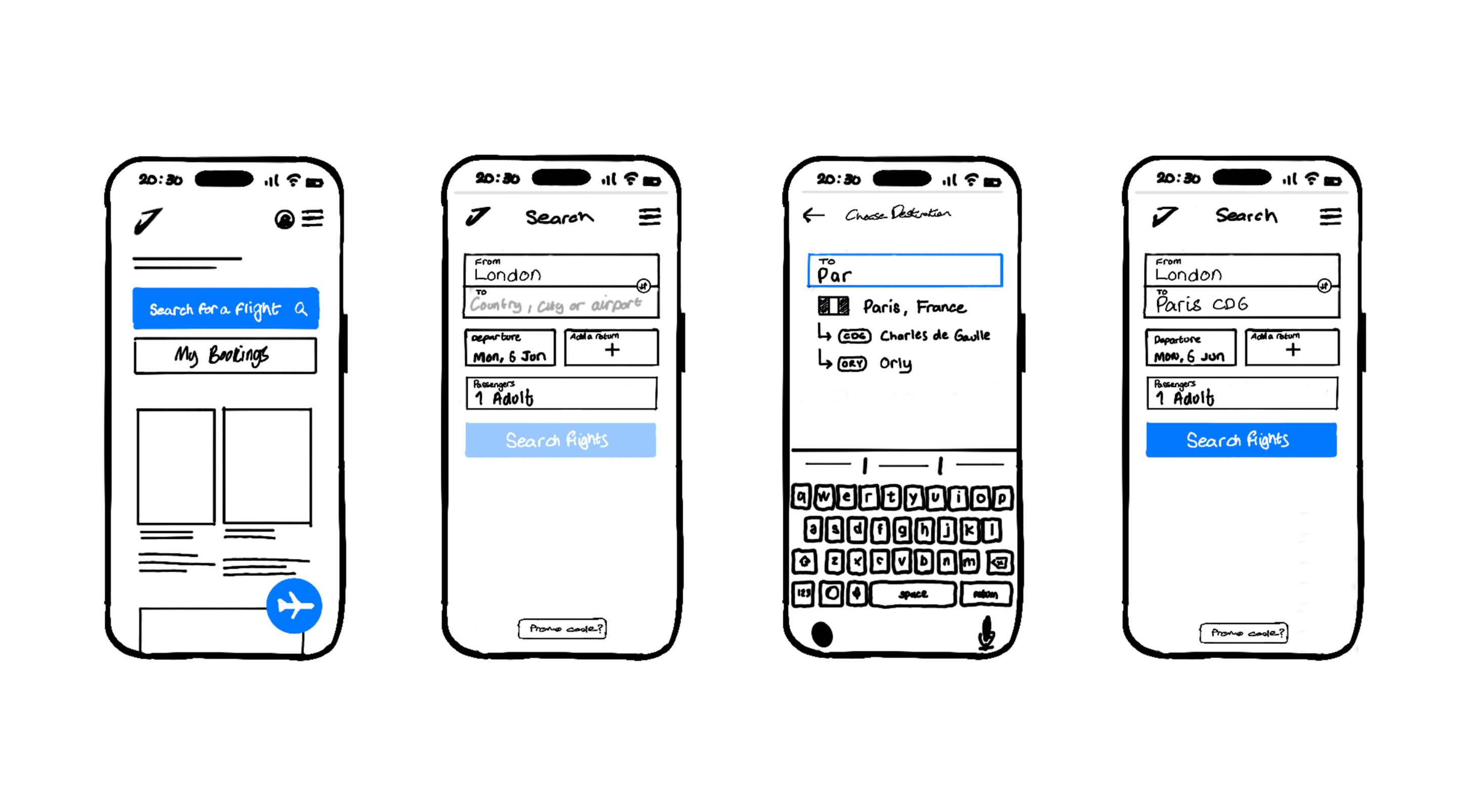
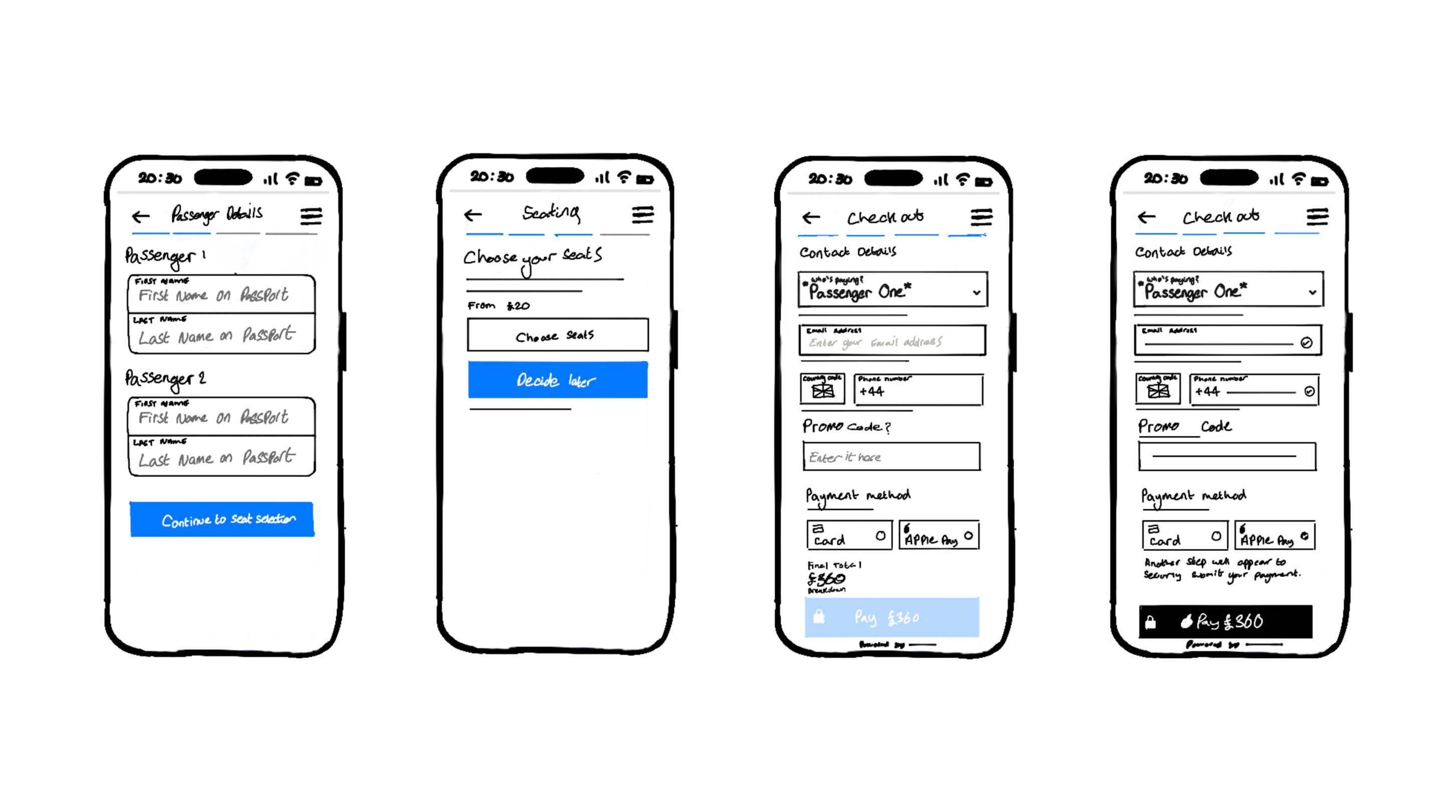
My goal was to expand on the flow diagram, sketching the screens for the website and addressing the identified issues and user goals from my research and analysis.
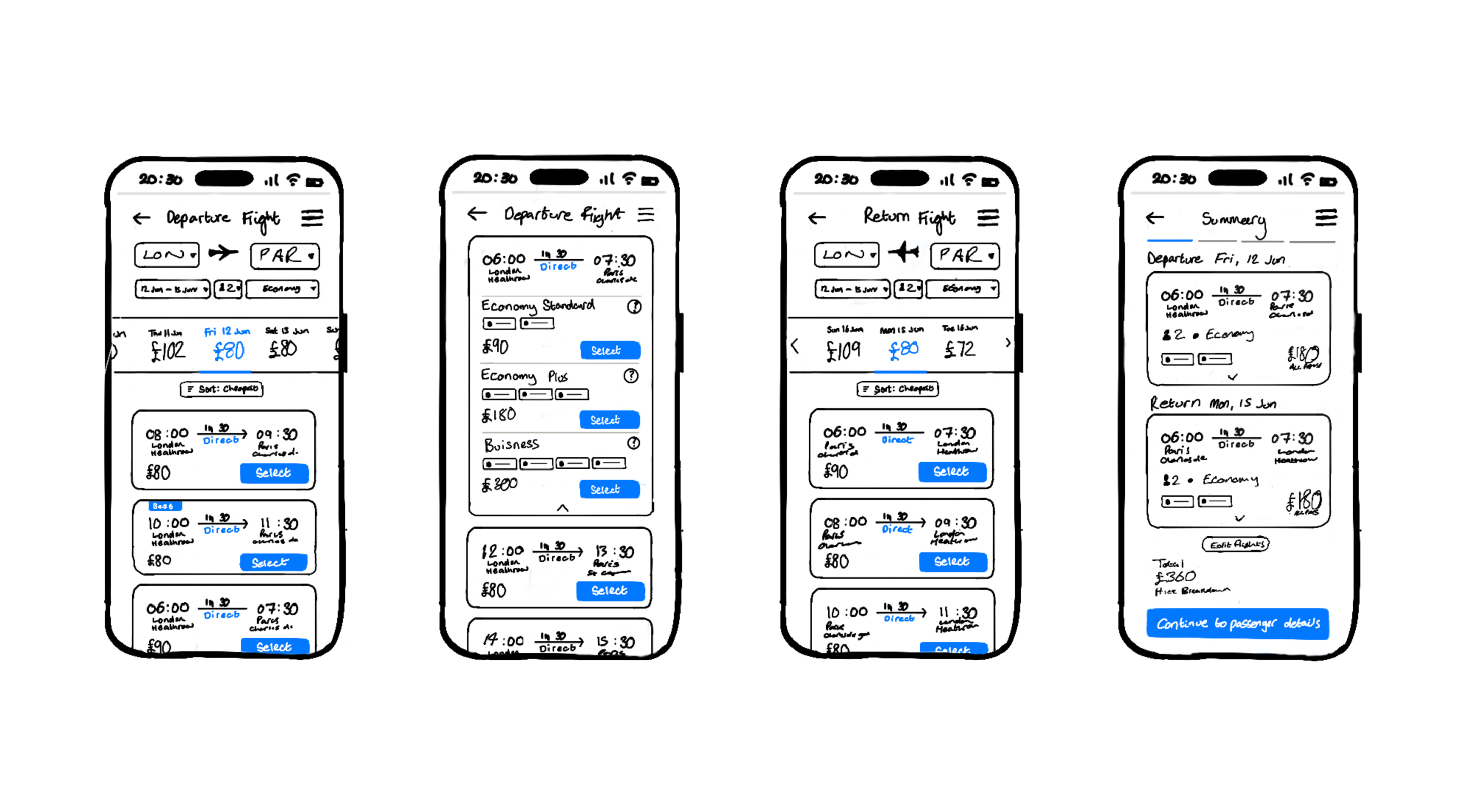
I started by listing all the required screens and their states, then proceeded to sketch them out to complete the flow. During this process, I carefully noted any issues for future refinements. After several iterations, I achieved a design I was happy with.
Notable areas of improvement:
- Focus on essentials: Eliminating unnecessary elements to maintain a clutter-free interface and ensure a clear hierarchy.
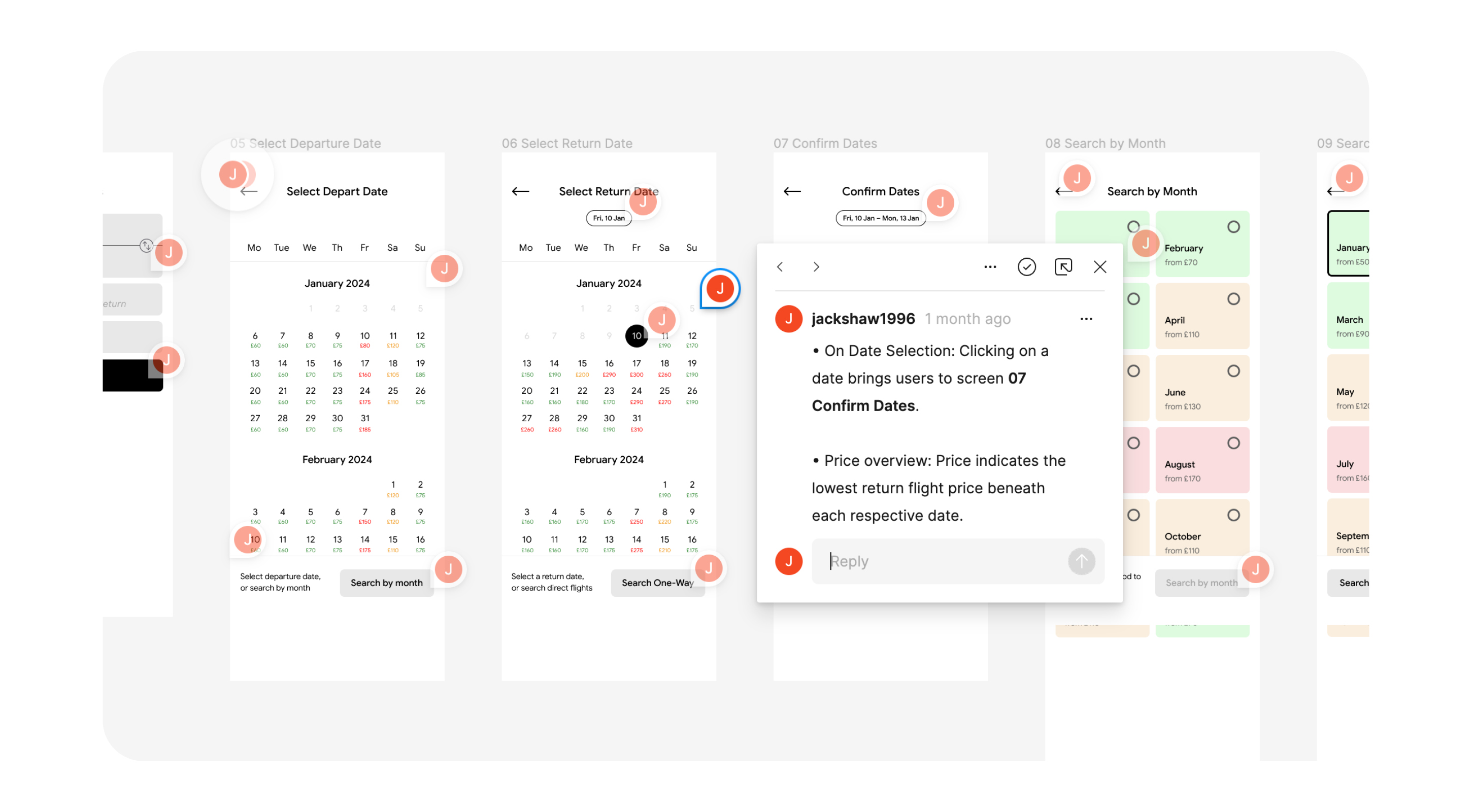
- Instant price comparison: Implemented a traffic light calendar system for easy assessment of the lowest prices on different travel dates.
- Increased perceivability: Added a clear CTA at the top of each screen, and used affordances in the calendar to subtly signal the date the user is selecting.
- Improved flight cards: Addressed pain points by highlighting connections, displaying full airport names, and enhancing call-to-action buttons.
- Progress indicator: Added a visual guide to enhance user visibility within the flow.
- Tags: Gives contextual information on some flights so the user can identify them as the cheapest, fastest, etc.
Eliminating everything but the essentials
A significant portion of my work centred on simplifying the designs and removing excess elements to create the clean, user-friendly interface my users were asking for.
Prototyping
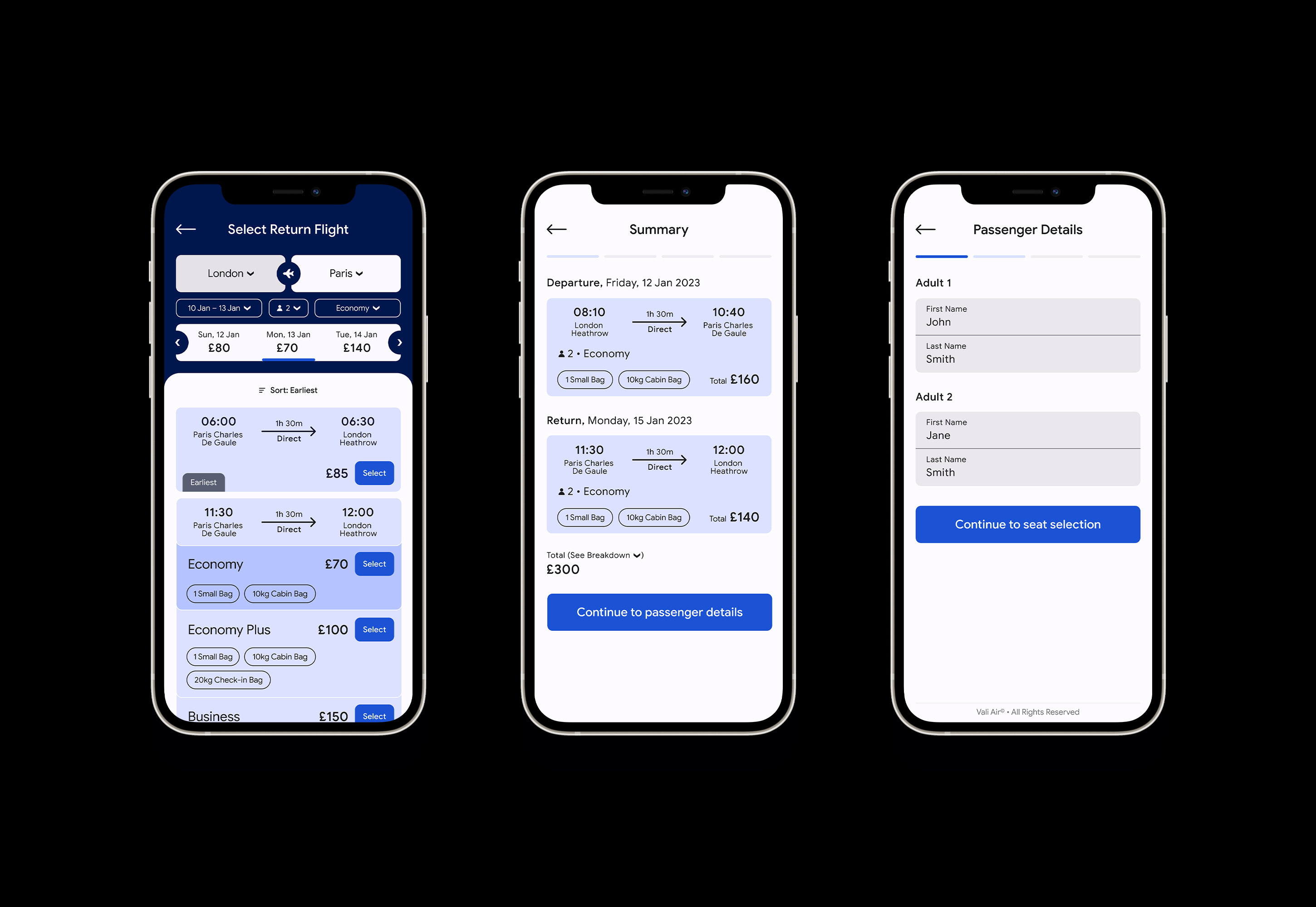
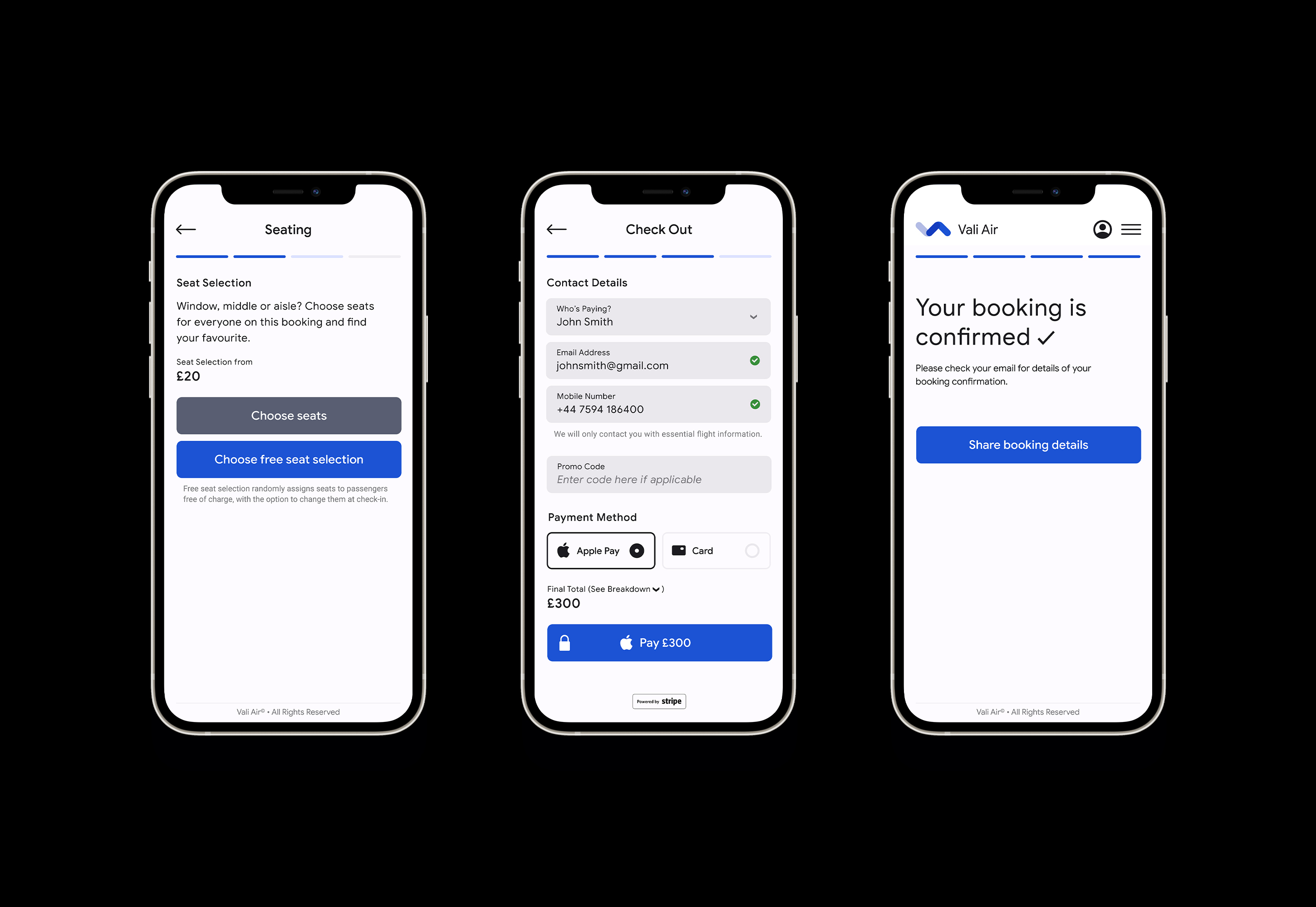
I transitioned to crafting a medium-fidelity prototype to gain a more in-depth understanding of the concept and flow. This allowed me to test the solution with users, assessing the effectiveness of screen layout, hierarchy, interactions, and labelling.
Guided by my sketches, I constructed the prototype in Figma, making note of any problems or inconsistencies. Through multiple iterations, I had a final solution ready for testing.
The most notable changes from sketches to screen:
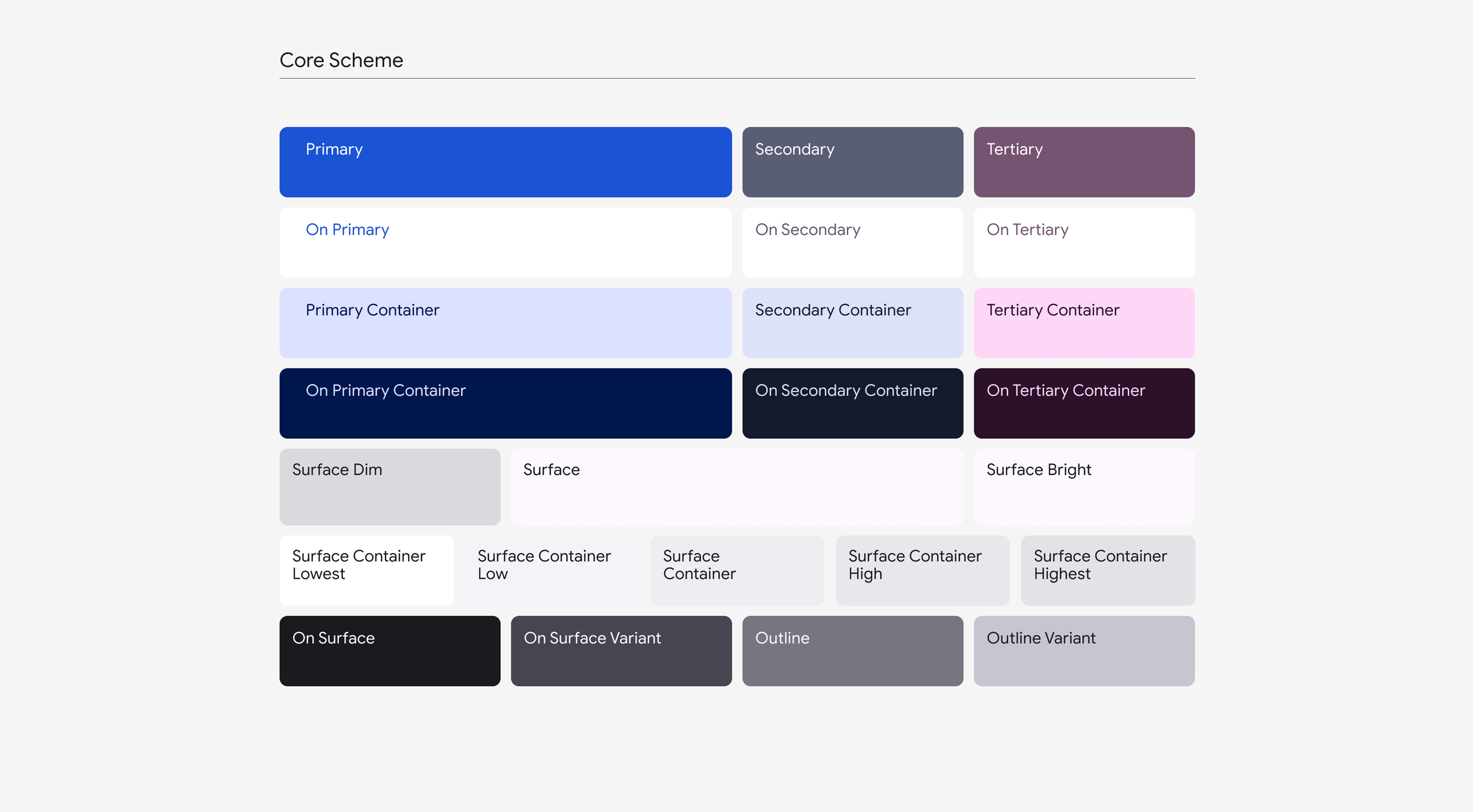
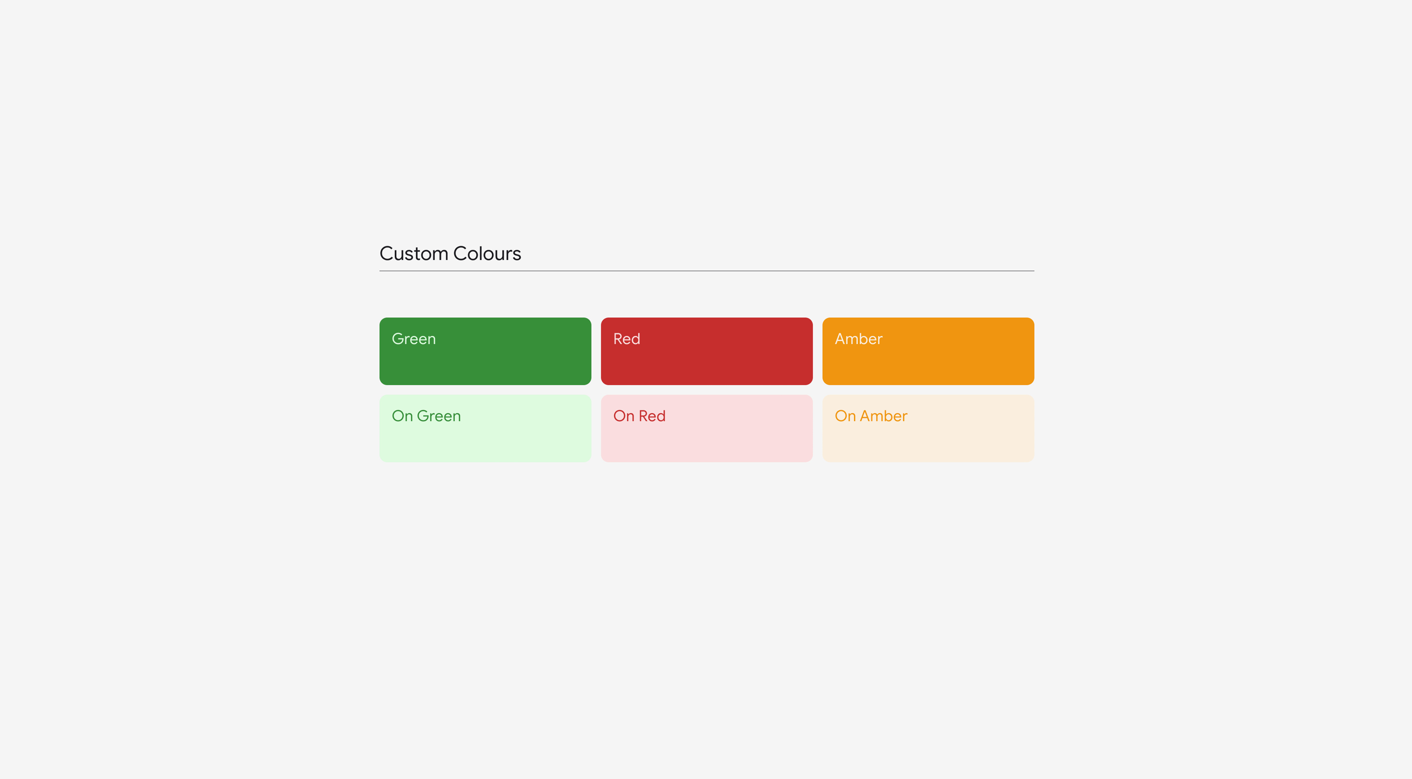
- Material3 Colour System: Used the Material3 colour system to add colour, using tints to create a hierarchy and distinguish between active and inactive input fields.
- Consistency: Ensured label consistency throughout the interface.
- Help: Offered assistance and reassurance where necessary, such as informing users that fare selection could be modified later in the process.
- Hierarchy: Adjusted component sizing on the flight selection screens, giving flight cards greater prominence as the primary interaction point.
04 / Validate
Any room for further improvement?
With the prototype completed, I sought to validate my solution and explore potential areas for improvement. To accomplish this, I conducted two additional usability tests.
Usability Testing the Prototype
These tests enabled a thorough evaluation of my designs, helping to pinpoint any last-minute issues and provide valuable guidance for teams in the next stage to avoid building poor solutions. The process closely mirrored that of my previous usability tests, beginning with well-defined research objectives, then test execution, and then a comprehensive summarisation of findings.
Some of those final, final, improvements:
- Accessibility: Simplified the design in response to a user with colour blindness who found the calendar's traffic light system confusing. Now, prices are displayed as figures next to each date.
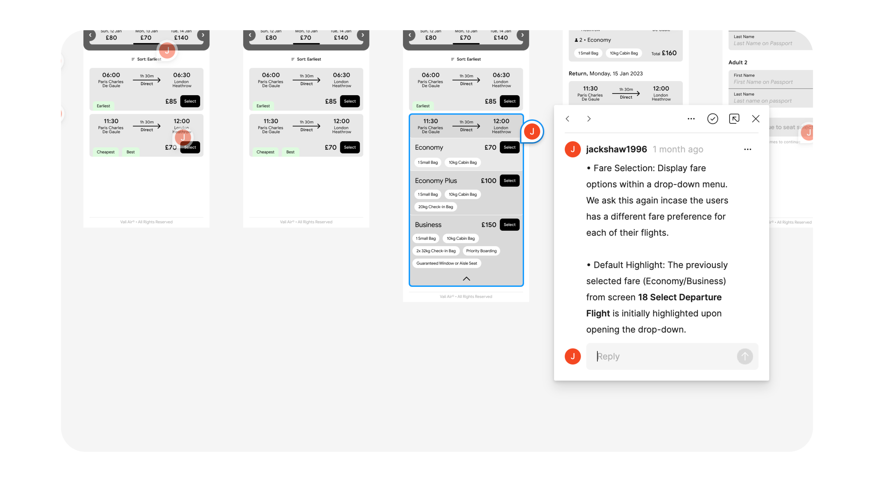
- Enhanced Hierarchy: Introduced tints to the flight fare selection drop-down. Previous fare choices are now preselected when a fare option is presented again, offering the user flexibility to select an alternate fare, but letting them know they have been heard.
- Positive Constraints: Improved user focus by removing the menu button, especially during checkout.
- Tap Targets: By making the entire component housing a radio button fully clickable, I enlarged the tap target making the component easier to use.
- Perceivability: Designed the destination airport to be less prominent than the origin airport, creating a digital affordance hint that the user is selecting their return flight upon switching.
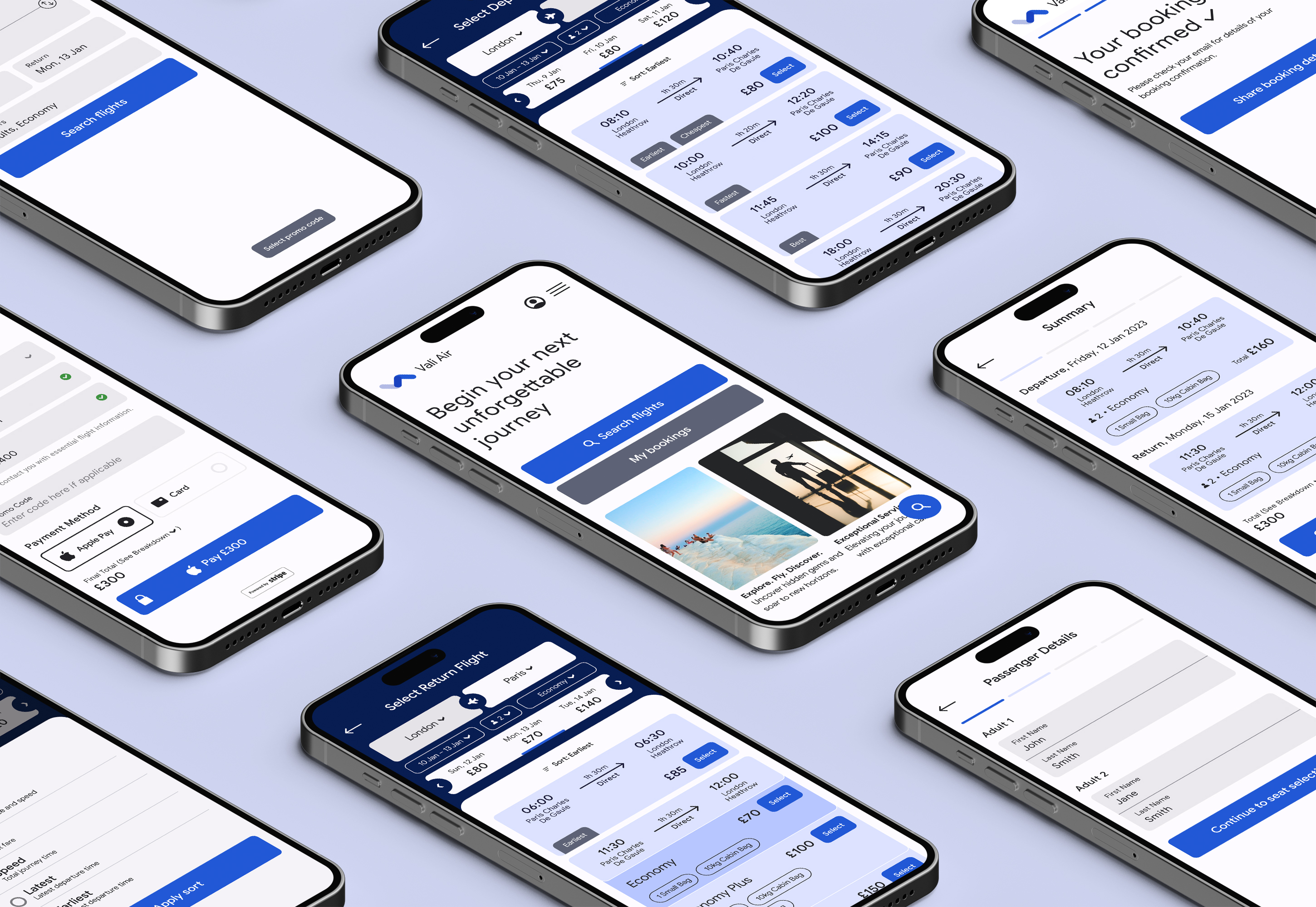
The Prototype
After completing the validation process, I finalised my solution. Please click here to explore the prototype and experience the improvements firsthand.
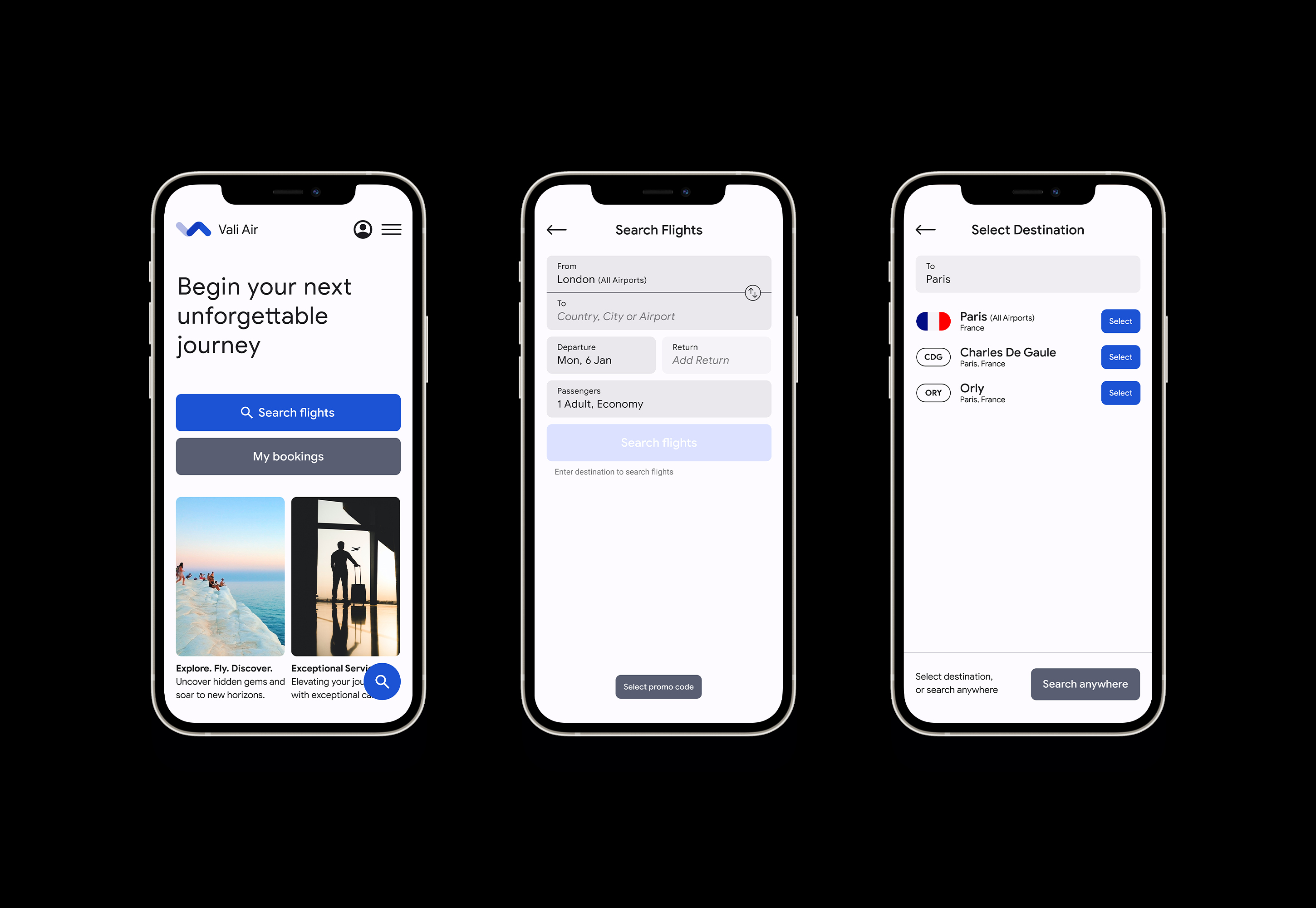
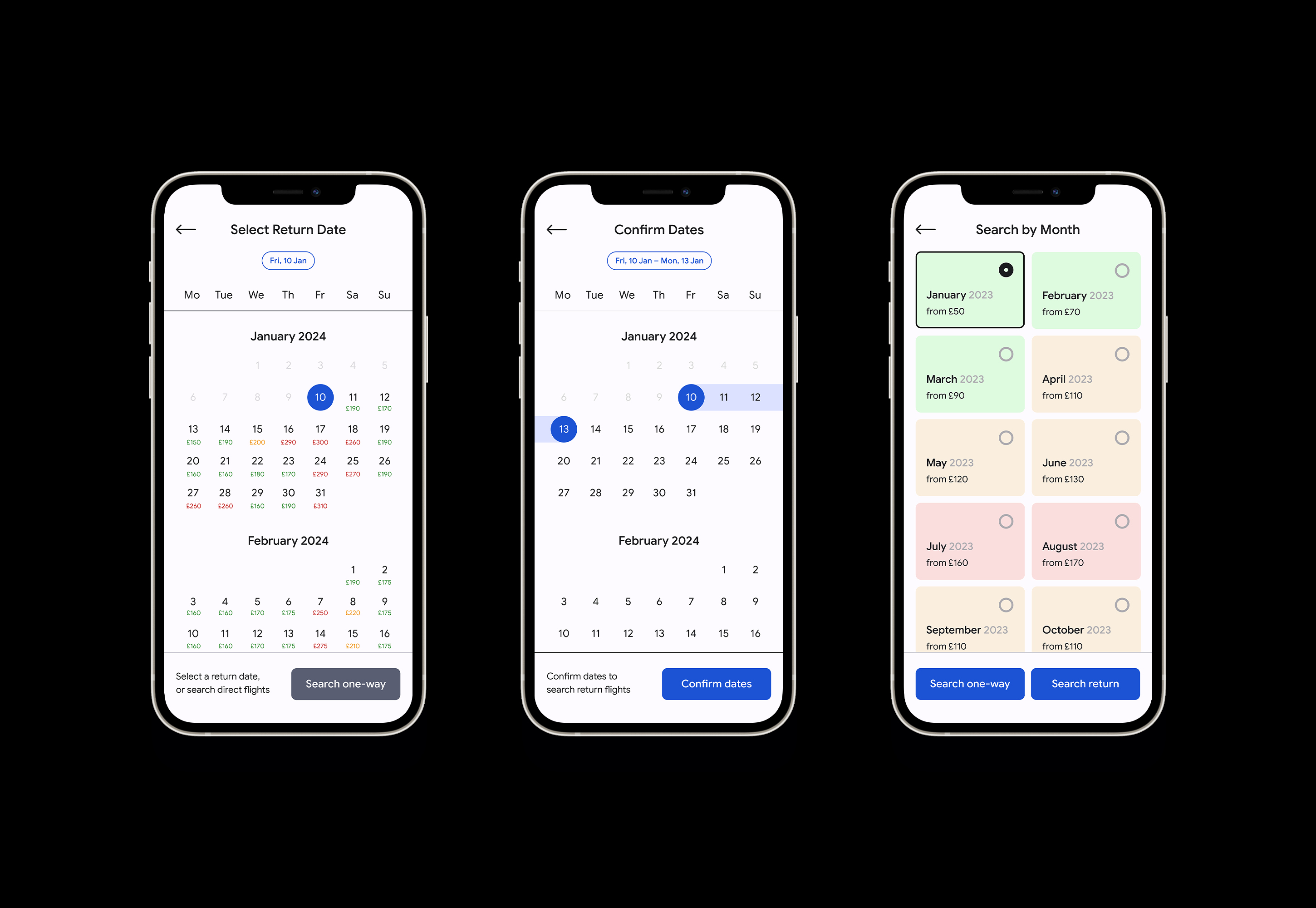
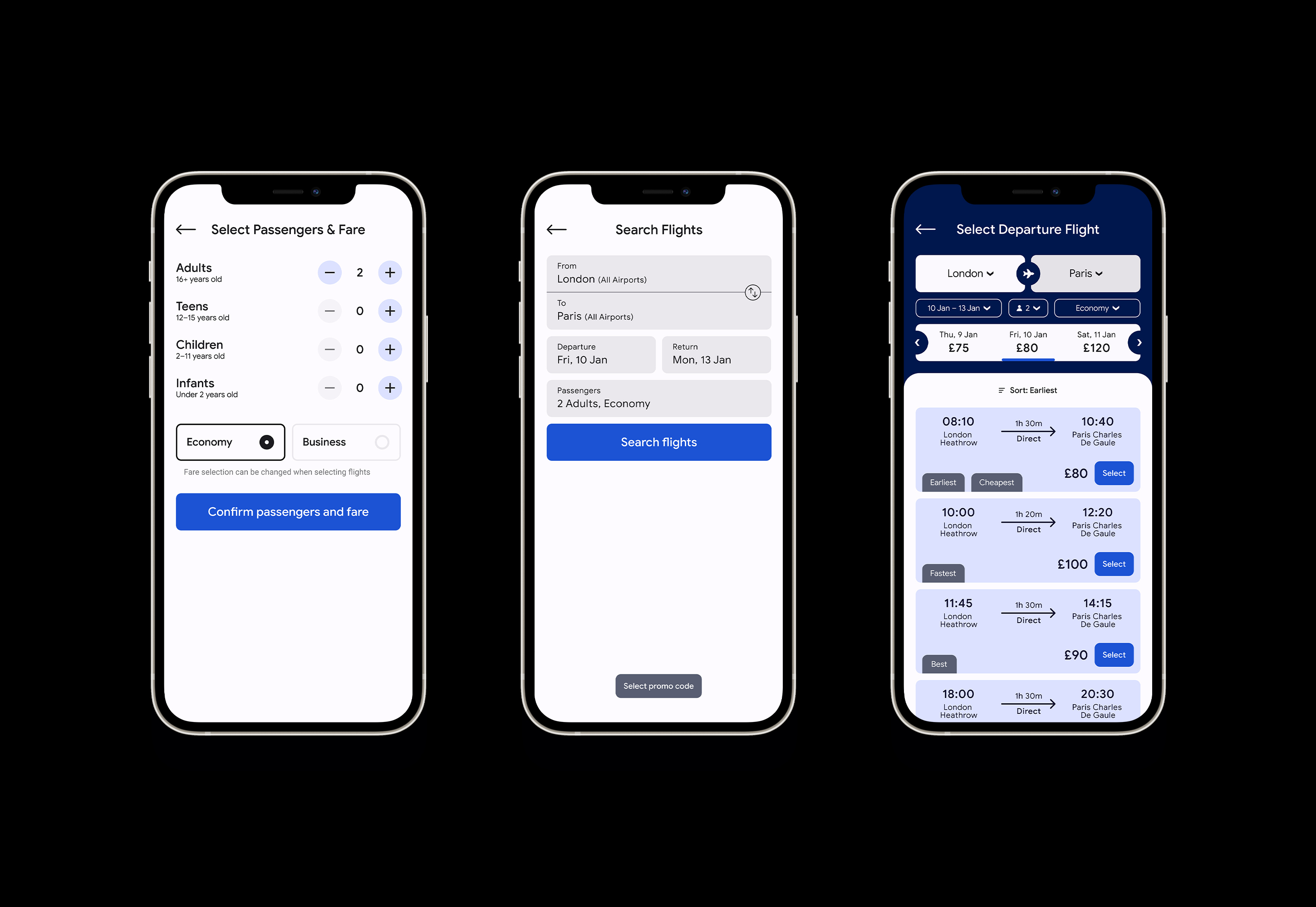
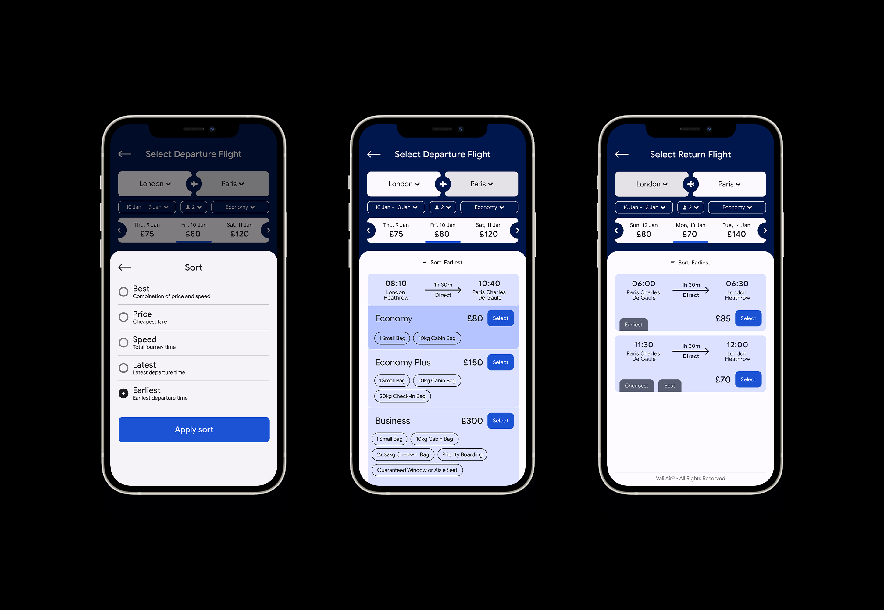
Annotations
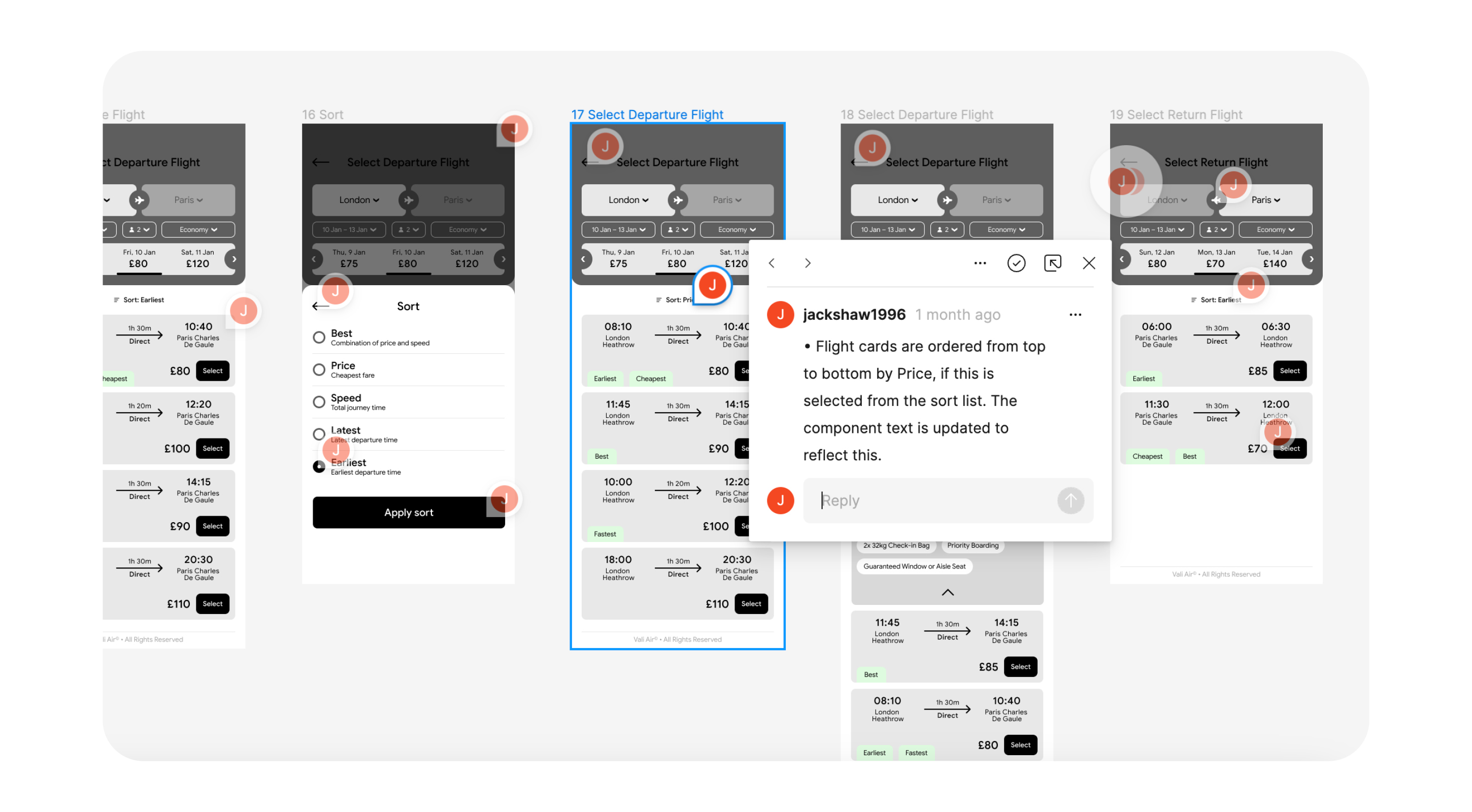
Along with the final prototype, I wrote a detailed set of annotations, thoroughly documenting user goals, interactions, rules, validation, and error handling for a future handover to developers.
Conclusion
What worked well?
The final usability tests were really positive, with users easily navigating through the flow to complete their booking. Here is what worked well:
- Informative Design: Essential information was forthcoming, such as contextual help with input fields, full airport names, and clear fare details.
- Price Comparison: Flight price comparison was readily available in different stages, such as the calendar and flight selection screen.
- Simplified Experience: We streamlined the process by removing unnecessary add-ons and upgrades, making it more straightforward for users.
- Clear Navigation: Users found it easy to progress through the flow due to a clear hierarchy and well-placed calls to action.
- User-Focused Details: Small design elements like loading animations improved the overall user experience.
- Guest Booking: Users had the option to complete bookings as guests, eliminating the need to sign in.
- Mobile Continuity: Users did not feel the need to switch to desktop for perceived safety or improved user-friendliness.
What I would change?
I'm pleased with the final prototype, but these are the factors I would consider for future projects to improve the final result:
- Sample Size: Consider increasing the sample size of the online survey for more comprehensive research.
- Stakeholder Engagement: Explore commercial considerations by conducting stakeholder interviews, particularly regarding add-on options like travel insurance and hotel booking. My research found these had low engagement, but to not include them should really be a wider debate.
- Prototype Enhancement: Expanding the prototype to include seat selection screens could provide additional room for improvement.
